
Design challenges happen in every renovation project. Some projects have bigger challenges than others. When the challenges are in your own home and you are the designer, mastering them becomes especially important. Some of the challenges were apparent in the first walk through of our new home. As an interior designer who thrives in the kitchen and home remodeling world, I knew the age of the home would be a factor. Challenge No. 1: All renovations should follow the architectural style of the home. Challenge No. 2: In this case the rustic modern style of the home directed many of the design decisions. The initial design took cues from both the home’s age and its architectural style.
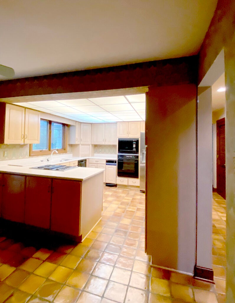
The original kitchen was designed and built as a part of the original house in 1980. It had a 7-foot dropped ceiling and a puzzling small footprint for a 3,000-square-foot home. The home itself has four vaulted ceilings, which created an even lower visual weight in the 7-foot kitchen ceiling. Built in the middle of the home, the kitchen was surrounded — up, down and around, by spaces that could not be altered without major structural efforts. Read and learn how solutions to major design challenges were mastered and how this handsome new kitchen complements the entire home — and our lifestyle.
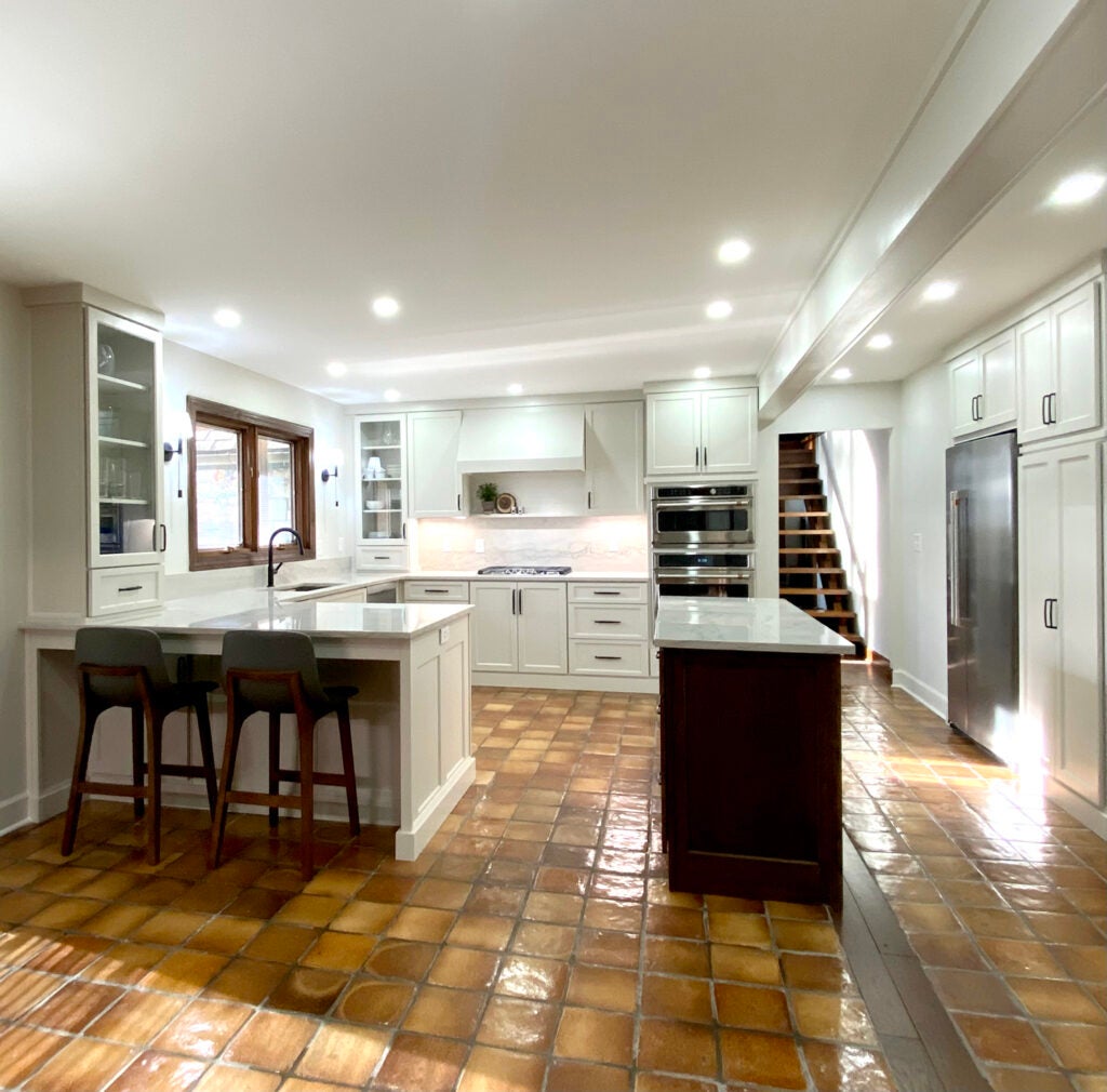
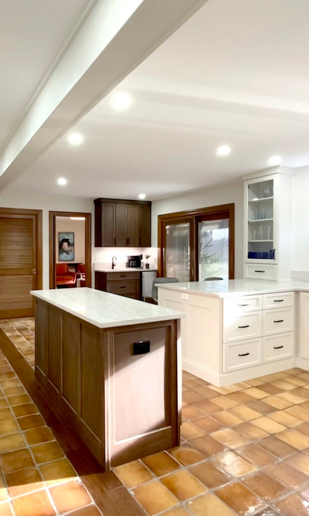
- Tile/flooring. The 7-inch-square terracotta tile seemed important to save as a throwback to the original home. It is a major design element as it runs through the foyer, hallways and kitchen. What we didn’t know is that this irreplaceable tile was never installed in crucial places. Challenge No. 3: The missing tile was not found until the demolition phase when the old kitchen cabinetry was removed. The new cabinet layout had to be revised and redesigned to hide the missing flooring. We envisioned a large 10-foot island with seating for 5. The reality was an island was reduced to a short 5 feet. Open traffic patterns were suddenly reworked to accommodate a peninsula to cover a rather large area of tile floor that was under a wall, which was removed.
- Ceilings/walls/lighting. No one knows why a false ceiling dropped to a 7 foot height was incorporated in the original design. The ceilings in the central part of the house were already limited in height at 8 feet. The dropped grid ceiling full of buzzy fluorescent lighting was the first thing to go. A long-standing trick to raise visual ceiling height is white paint. Simple white paint helps solve an 8-foot ceiling problem. To layer the lighting, 4-inch recessed LED lights and wall sconces were used. Predictable dropped pendants over the peninsula and island were not included to keep site lines clear and the visual weight going up. The gap where the (unexpected) load-bearing wall was removed, was filled with hardwood to coordinate with flooring elsewhere in the house. Recall, we had one-of-a-kind impossible-to-source tile. It was not ideal but has now become an added bit of character.
- Cabinetry/appliances. Dated pickled oak cabinetry was exchanged for not-quite white cabinetry. The warm beige painted cabinetry ties to the earth tones of the terracotta tiles and the quarried stone on the exterior of the house. In keeping with the rustic modern style of the home, the cabinetry was designed with a flat crown and flat baseboard for a more casual, modern appearance. The flat nature of the crown and base also elongates and raises perceived vertical height. The simply constructed vent hood was designed to eliminate busy horizontal lines that complicate the goal of raising the visual height. The coffee bar, which includes a bar sink and icemaker along with the small prep island, are stained dark walnut in a matte finish to remain informal and minimize its appearance.
- Paint/stain. There is only one color of paint (other than the purposefully painted ceiling) used in the entire kitchen – Benjamin Moore Pale Oak. Walls, trim and cabinetry are the same color. This design trick adds visual lightness to an otherwise closed space. By varying the sheens, dimension and detail are enhanced, but in a muted way. Note the door and window trim are stained. The original baseboards were also stained. Another trick to raise the visual height of the ceilings (and room) was to paint the baseboards the same color as the walls. The rustic character of stained wood remains, but the horizontal line created by a baseboard (an unwanted break in the vertical line) is diminished.
- Stone/metal. The natural quartzite countertops were chosen for the gray and beige tones found throughout the stone. This neutral color selection ties to the quarried stone of the existing fireplaces, and the exterior stone. The elegant dark gray veining coordinates with black plumbing fixtures and black cabinet hardware. The precise horizontal veining helps exaggerate the length of the peninsula and islands. Shorter blocks of veining run with the short section of stone cut out by the sink.
The project team includes interior designer Terri Bennett, Terri Bennett Interior Design; contractor Ben Harp, Harp Design and Construction; electricians Mark Wright and Eric Northcutt, Dunn Wright Electric; and cabinetry by Tod Walters, Walters Custom Cabinets in Hodgenville.