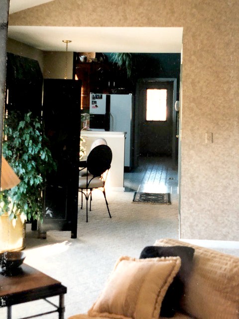
The long wait and the final reveal on the Bittersweet Lane renovation of Michael and Sheila Mulligan’s contemporary ranch is finally here. A look back at pre-renovation photos documents the fact that this kitchen, great room and outdoor living area project was a major undertaking …and an unequivocal success. By paying attention to every detail, the decisions made early in the project become noteworthy in the final reveal.
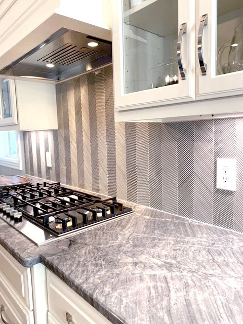
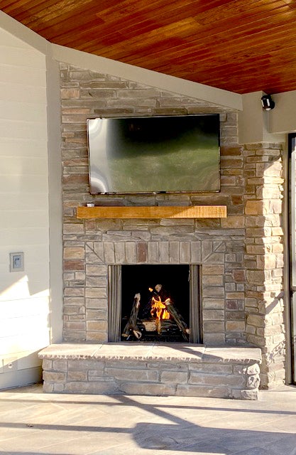
Details included numerous textural elements, such as rustic stone, natural redwood and earth tone tiles used in the outdoor living area which was perfectly finished out with phantom screens, a cozy gas fireplace and outdoor television. The interior features high contrast ivory and matte black cabinetry, unique tile backsplash, detailed finish carpentry, custom coordinated hardwood flooring, high end stainless appliances and lantern inspired light fixtures that blend black and polished nickel with a touch of crystal. Beautiful details are integrated in every aspect of the project. Improved function was built in.
The project was not just about aesthetics. It was also about space — the reallocation of space and the use of newly created space. Modifications to the home significantly changed its livability. Living spaces became open and fluid.
- Big things. By bumping out the back wall of the former kitchen and dining area a mere four feet, and the removal of major walls created significant new space. Load bearing walls are now supported by integrated structural beams and a single, nicely detailed column. The interior now features broad openings that provide transition between the vaulted great room and the new kitchen area. A massive new outdoor living area was constructed where a simple pergola once stood.
- Little things. Thoughtful details make a striking difference. Outdoors, a redwood ceiling covers the massive vault and grounds the space while adding warmth and character. With personal tastes leaning toward intricate detail, the Mulligan’s specified strong dimensional details on the base and trim moldings throughout the new areas, and raised panel cabinetry profiles that feature simple, elegant hardware.
- Functional things. The footprint of the kitchen was expanded by more than double its previous square footage. A large 8-foot island supports numerous seated guests. A small, comfortable sitting area adjacent to the kitchen provides more intimate seating. Cabinets with deep drawers and rollouts provide new storage. A built-in pantry was creatively pushed in to void garage space and aligned with the refrigerator to create more seamless storage.
- Material things. The floor of the outdoor living area wasn’t just finished off with standard concrete — large format outdoor tile was selected. Interior floors are stained a custom medium gray/brown to coordinate with gray finished walls. Rather than the large island taking up visual space in the middle of the room it is matte black to diminish its size, and to provide high contrast to the ivory perimeter cabinets. A deep composite sink provides a richness standard stainless would not provide.
- Beautiful things. By maintaining a neutral color gray, black and ivory palette throughout the home, the smallest design decisions shine. From the muted gray granite selection, to the interesting chevron patterned glass backsplash tile, and the brushed nickel on the hardware — every detail was considered. Outside, the rustic stone fireplace, decorative ceiling, earth toned tile, black phantom screening, and the unique truss-like brace detail all add to the character built into the renovation.

