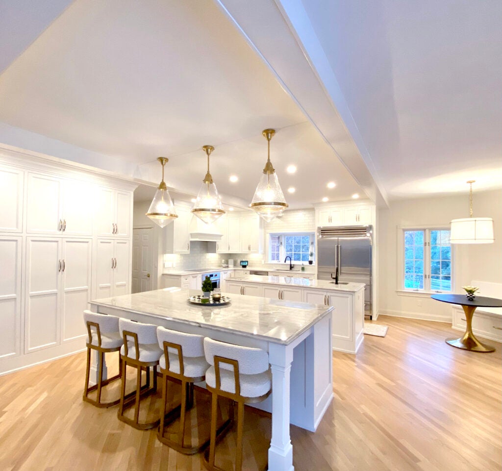
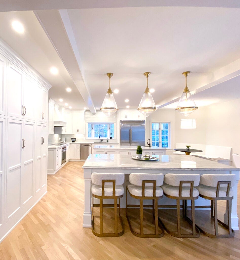
What began as a basic kitchen remodel to update a dated mission themed kitchen evolved into an elegant kitchen that anchors a newly created open concept floor plan. With a “what if we did this” suggestion, and cooperative teamwork between homeowners, a willing contractor, and designer, the original plan went an entirely new direction. The “what if” revision proposed a highly functional open concept floor plan in a previously sectioned off layout. It incorporated every square foot of available space to create a kitchen for grand living and entertaining. What started as a project to update a galley kitchen, it ended as a creatively designed chef’s kitchen with double islands, coffee station and casual dining options.
The project was by no definition a simple project. Load bearing walls were removed and ceilings were stabilized with stress rated engineered wood beams. An existing powder room was relocated to an unrelated area of the first floor. Cabinetry was designed to reorganize work zones, include well planned storage, and accommodate a full suite of luxury appliances.
The original kitchen was a well-built, high end Mission style space. But it was dark and closed in, creating a mood completely predictable with heavy oak cabinetry and the dark colors associated with Mission style design. In the end, the homeowners pursued a more versatile layout with function that could not be achieved in a galley layout. True to the revised vision, the new light filled kitchen now embraces a gracious flow through the main areas of the home.
- The Aesthetic. With the goal of creating a light filled combination living, dining and kitchen space, all decisions related to finishes and color center around variations of white with brass accents. All cabinetry was finished in a soft white paint. The wall and trim paint are finished in Sherwin Williams White Duck. Quartzite countertops have variations of ivory and beige. The adjacent dining room has walls of soft beige suede wallpaper. The furnishings are neutral in variations of white and beige.
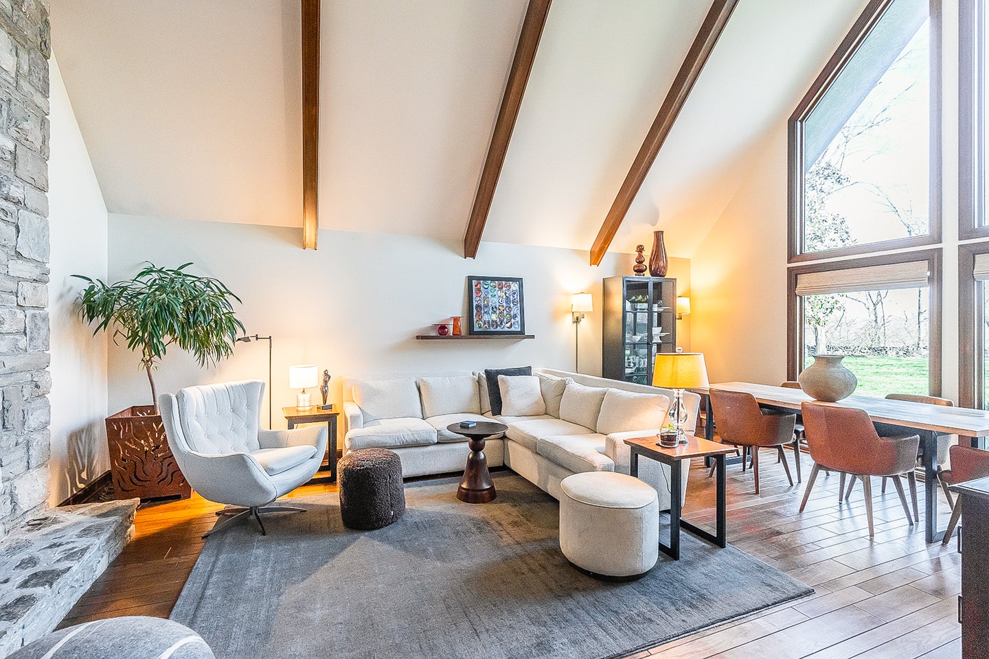
- The Space. By removing the main load bearing wall, the kitchen is now a continuance of the great room. A rear wall of windows created a room filled with natural light. In the adjacent hearth room, the fireplace was transformed from a heavy oak surround and mantel to a transitionally styled fireplace painted to relate to the cabinetry. The same quartzite stone used for countertops was built into the floor as a hearth stone and used as a decorative insert for the surround.
- The Mechanics. With additional square footage creating space, why not create a chefs kitchen complete with luxury appliances? The built in Sub-Zero stainless steel refrigerator grounds the back wall of the kitchen. A Wolf gas cooktop and two Wolf ovens set the stage for elevated cooking experiences. The appliance package wouldn’t be complete without under counter appliances, including a microwave, nugget ice maker and wine refrigerator, built into the two islands.
- The Stage. The original oak flooring laid on a diagonal in the kitchen added character to the original house, but its dark stain didn’t work with the new aesthetic. By sanding the hardwood and finishing it with no stain (or color) allowed the floors to cohesively ground the lightness created by the light cabinetry and walls. Small amounts of a darker walnut hardwood define the dining area. The combination of light and dark hardwood creates interest and keeps defined areas separate.
- The Light. With a primarily monochromatic space, the choice of lighting was important. Numerous recessed fixtures and under cabinet lighting support the work zones. Statement pendants from Visual Comfort in glass and brass add sparkle and interest. This group of three large scale pendants hang above the second island to define the kitchen and break up the vastness of the large space. A more subtle fabric drum pendant hangs above the banquette and casual dining table. Two elegant, yet simple brass sconces with fabric shades were used to highlight the fireplace mantle and surround.
The project team includes interior design by Terri Bennett of Terri Bennett Interior Design; contractor, Ben Harp of Harp Design and Construction; electrician, Mark Wright and Eric Northcutt of Dunn Wright Electric; paint by Ernie Bowman; cabinetry by Greg Barber of Barber Cabinet Company.
