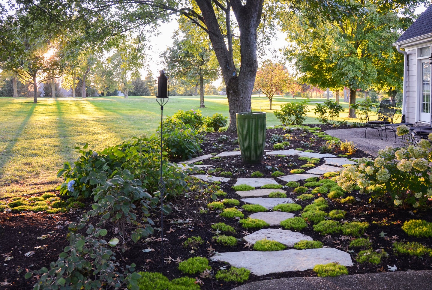
Understanding the potential of a property requires vision. Tackling value-added projects is an exercise in patience. In May of 2020, this family purchased and immediately started the renovation of the 40+ year old home. Early projects included the replacement of decking, a new roof, painting of the exterior brick, landscape upgrades and an in-ground pool. Each of these projects transformed the mish mash personality of the home into a thoughtful rustic contemporary styled home. As a finale, the owners of this Two Creeks home are nearing completion of a long overdue kitchen remodel.
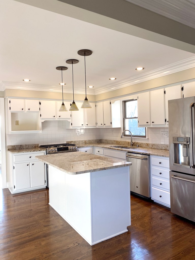
Previous owners of the home passed over a much needed kitchen remodel. Solutions weren’t readily apparent. It took being open to a reconfiguration of the space to create an expanded footprint. The design dramatically changed how the owners will use and enjoy the home. Gone is the problem range with no exhaust, narrow clearances and the limited amount of work surface. The new design resolves the tedious limitations of the original kitchen.
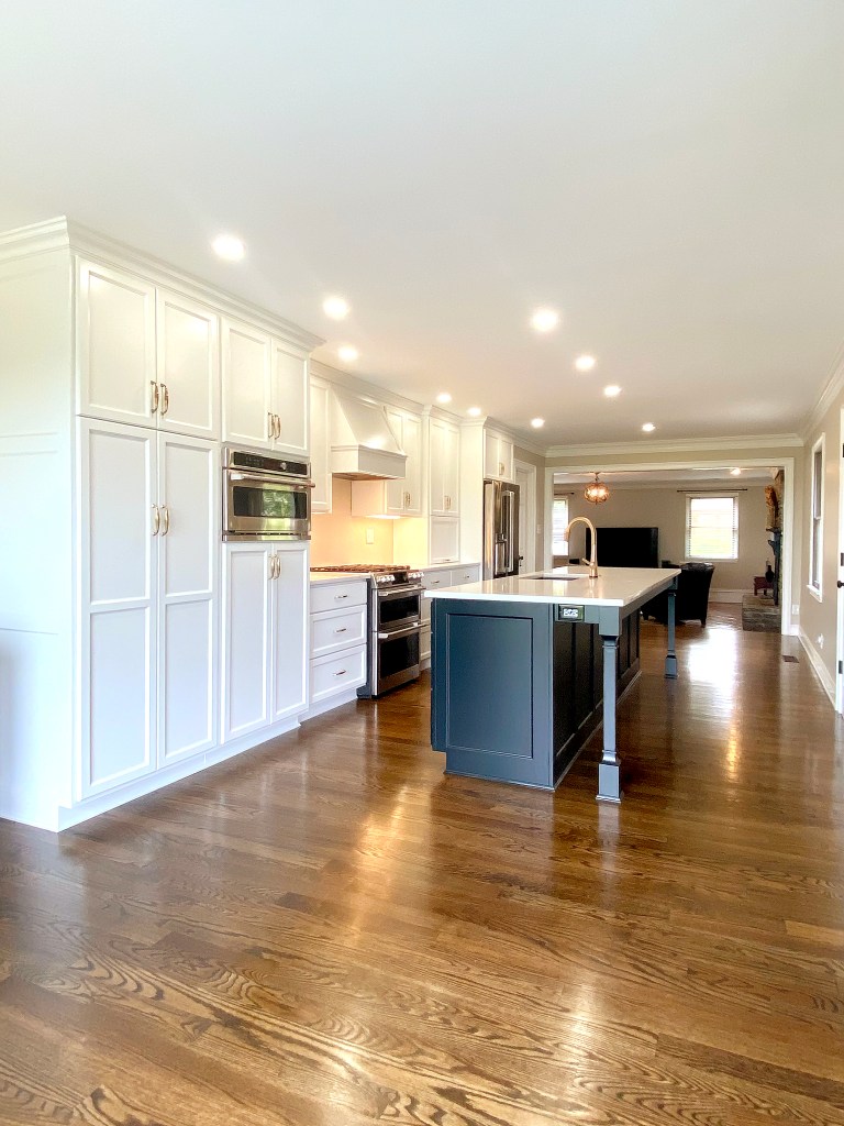
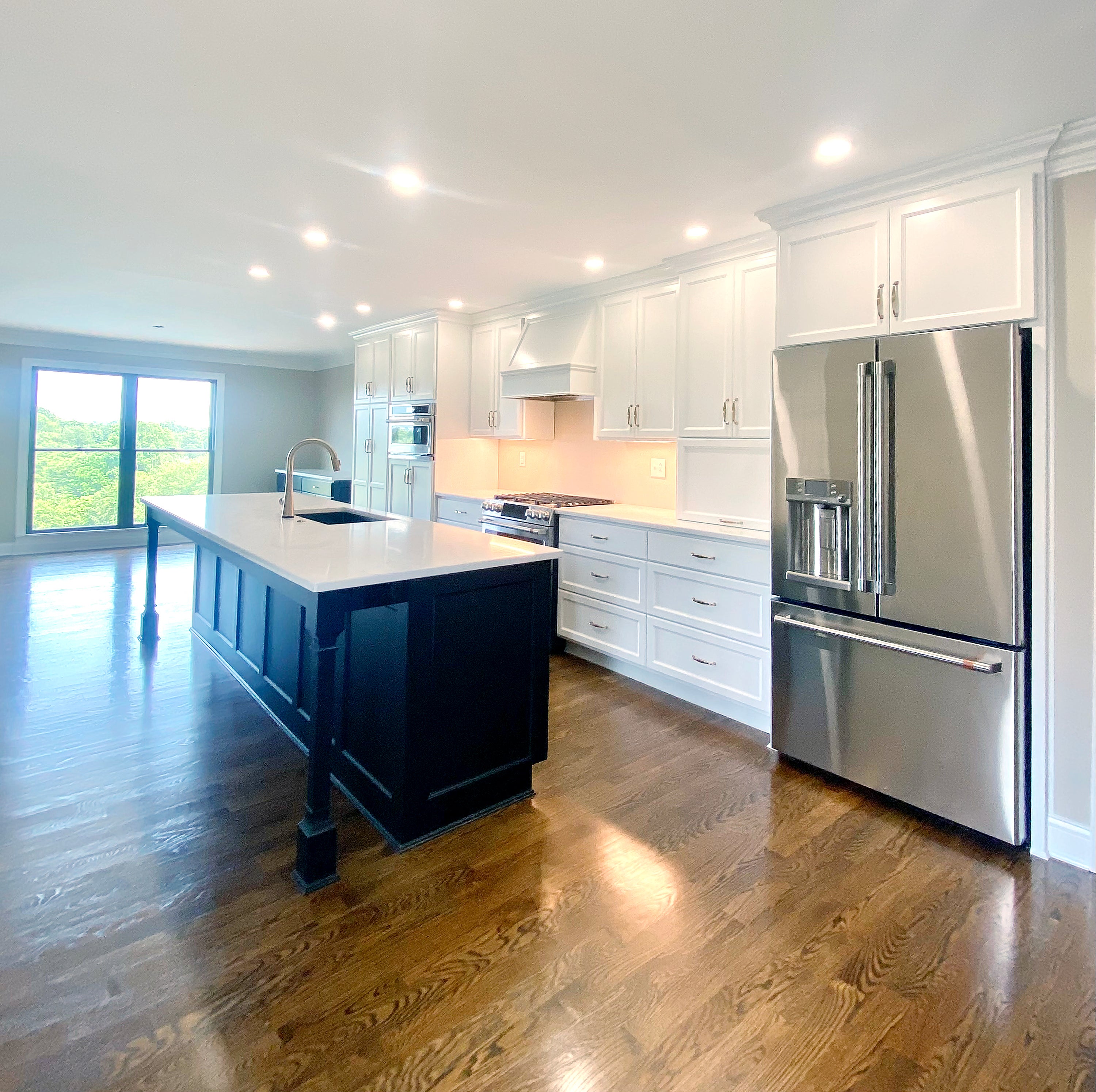
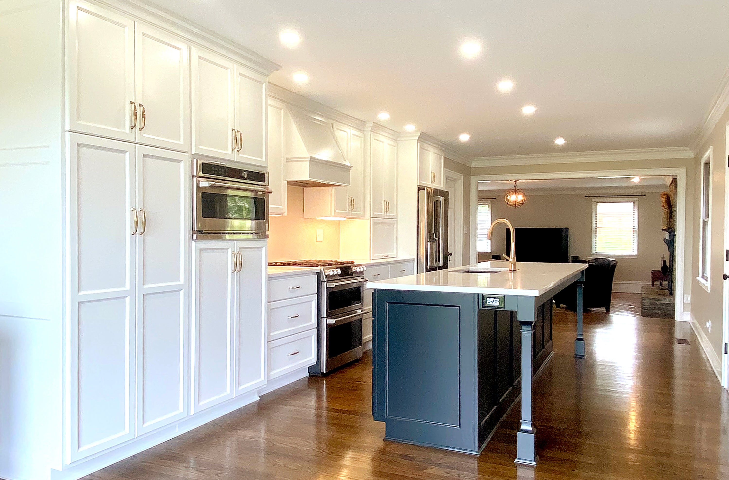
The before and after photos of this kitchen project document how function and pleasing aesthetics, improved the livability of this home. The addition of new furnishings, including a modern hand-crafted pedestal table and a modern chandelier, will complete the transformation. Completion of the project creates an invaluable appreciation for a kitchen that adds both value and function. Visualizing the potential has resulted in a beautiful reward.
Team members for the project include design by Terri Bennett/Terri Bennett Interior Design; construction by Ben Harp/Harp Design and Construction; cabinetry by Barber Cabinet Company; paint by Ernie Bowman; plumbing by Monroe Plumbing; and electric by Mark Wright/Dunn Wright Electric.
- Demolition: By removing a short, non-load bearing wall between an unused formal dining room and the kitchen, a much larger, open concept kitchen was created. The new space didn’t eliminate the dining room but converted it to a more casual dining option. A small window, over the existing sink was closed in with drywall and rebricked from the outside. (The exterior brick was painted, so it was an easy task to blend in.) The existing kitchen had well-maintained original hardwood floors that were patched and refinished for a seamless transition.
- Floorplan: A new, expanded footprint allowed for the kitchen to be completely redesigned. The sink was relocated to the expansive island and the range was moved to the center of the long wall of base and wall hung cabinets. A functional work triangle was restored. The floor to ceiling pantry provides an anchor on one end of the perimeter cabinets, with the refrigerator providing balance on the other end. Because the new floor plan opened up a new casual dining area, the layout includes a long, built in buffet cabinet. An existing panoramic window was enlarged and relocated (slightly) to align center of the new open space. Key design elements of balance and proportion were incorporated for a well-designed aesthetic.
- Appliances (and Plumbing selections): An existing GE Café range was incorporated into the new kitchen. A full suite of stainless GE Café appliances was purchased to complete the design. The choice of the distinctive Café line of appliances adds a custom touch to the project. A stylish Delta faucet in Champagne Bronze was chosen to coordinate with a striking Signature Hardware graphite (black) undermount sink.
- Cabinetry: Following current trends a high contrast black and ivory color palette was used on the custom Barber Cabinet Company cabinets. Using the color black for large islands incorporates a design secret that keeps large islands from dominating a kitchen. The color black recedes and keeps the island from looking too large or chunky and keeps it in perspective with the perimeter cabinets.
- Tile: Small format, polished glass tiles in a herringbone pattern (currently on backorder) will complete the backsplash. The warm caramel color of the glass will provide subtle warmth against the start black and white cabinetry while contributing to the neutral color palette. The relatively small amount of tile will run under open perimeter cabinets to add a glamorous final touch to the kitchen remodel.
