In a time when design trends are leaning toward simplifying and un-decorating homes the design industry has found a way to balance the aesthetic. It’s wallpaper! Neutral color and texture create calming comfort for today’s living. But color accents and subtle texture complete the look. In today’s world of wallpaper, color and graphics are bold. These bold, small gestures break up — the white, the beige and the neutral.
Modern prints and textural wall products have high contrast color and large motifs. Striking pattern is the story. What, why, when and where, become the questions to consider before investing in wallpaper. Before eyes are rolled and nightmare stories about removing old wallpaper are told, the current trend has proven itself worthy. (My husband exhibited a frightful frown when I recently jumped into the new world order of wallpaper.)
The wallpaper of today is meant to make a statement. It becomes the base for an interesting site line, or a stunning “moment” when used on a single accent wall or in a space like a small bathroom. A successful foray into this bold new trend follows the 5 W’s.
- What. Whether it is a high-end vinyl, hand printed paper or highly textured grass cloth, the wallpaper market today is designed with impact in mind. The patterns and motifs are generally larger and the colors vibrant. The materials are sturdier and the applications are more forgiving. By sourcing from large wallpaper suppliers, like Perspectives in Lexington, the choices are unlimited. Manufacturers like Schumacher, Thibaut and Phillip Jeffries carry high end designs, whereas long time companies like York and Seabrook produce product in a wide variety of price points. Consider the wider, commercial grade wall coverings for a new take on traditional patterns.
2. Why. By incorporating a single accent wall in wallpaper, you can make a big, big impact. With interior design turning toward more neutral spaces the addition of wallpaper keeps the overall aesthetic from landing in a dull zone. Pull a favorite color from a pillow or chair and translate it to the wall.
3. When. To jump in on current trends, why wait? It is a great way to brighten winter walls and lead you into spring. A moderate investment in a new wallpaper can jumpstart your next design project. It can invigorate a well-designed, but time worn furniture layout.
4. Where. Many of the new patterns are bold, colorful and fancifully. It is best to limit wallpaper to a single wall, portion of a wall or small powder room. Be careful — do not let the wallpaper overpower the room. The goal is to add color and interest, not steal from the overall aesthetic. A large pattern, in vivid color that covers the entire circumference of a bedroom, living, dining room would feel claustrophobic. A little goes a long way. The soft texture of grasscloth can add subtle richness and elegance.
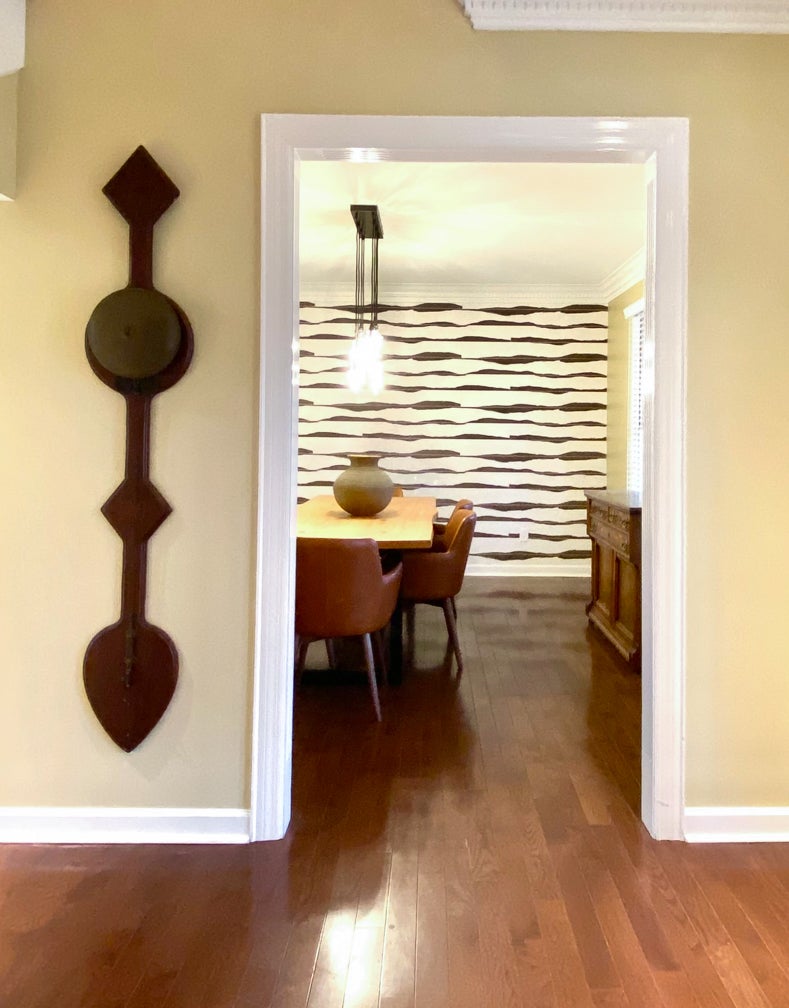
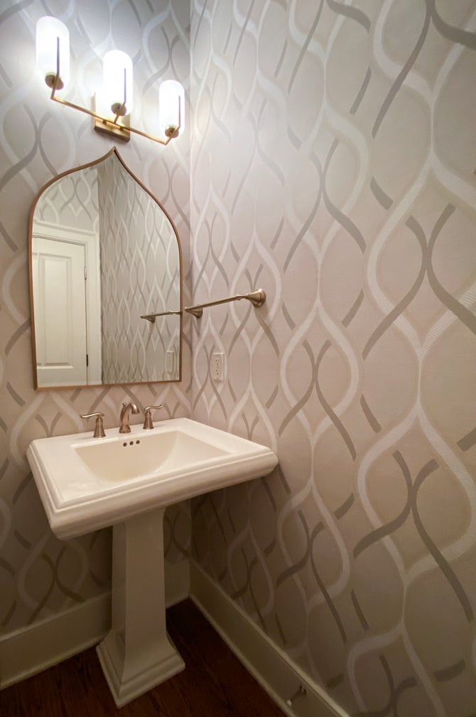
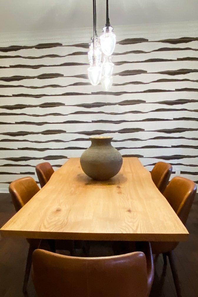
5. Wow! The pattern in my dining room (pictured) adds high contrast color, and interest. It becomes the focal point when looking into the room, but because it is a variation of a plank wall. It also compliments the live edge dining table. Seen from the entry way, it’s an accent without overpowering. The subtle, modern pattern recently installed in a client’s powder room works in this small space by adding movement to the intimate space. The taupe/gold tones compliment the brushed gold plumbing fixtures and presents a complete design.
