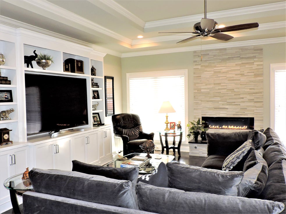
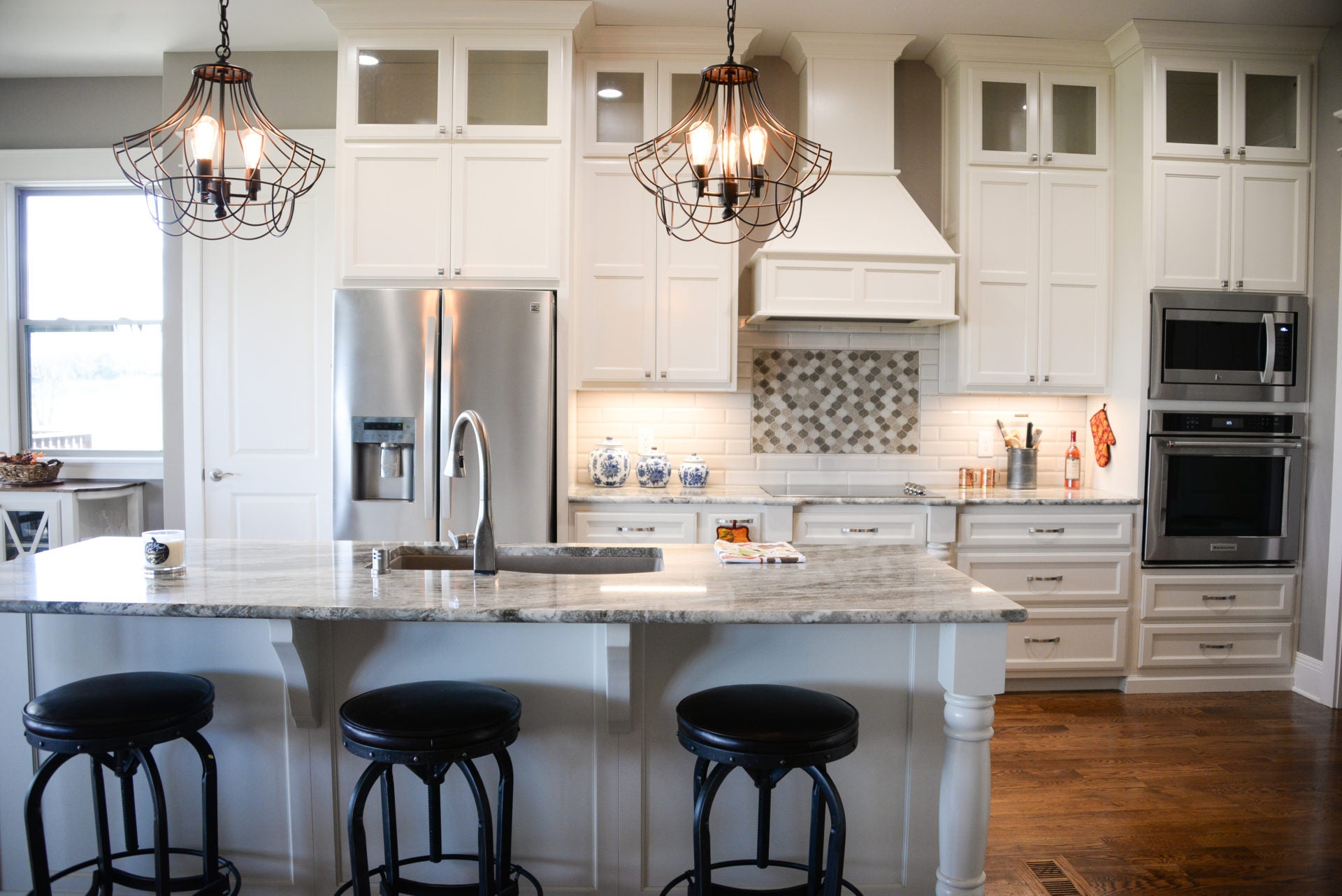
The beautiful newly constructed home for Curtis and Debbie Milton was designed around a high contrast color palette of black and white throughout the home. The result is a sharp, modern aesthetic. The master bathroom design (revealed in the November FRANK) was just the beginning of a consistent theme that runs throughout the home. The main living areas, which include the great room, kitchen and casual dining area, set the tone for a beautiful combination of varying grays against modern textures.
Because the home has a fairly open floor plan, a priority was placed in integrating the spaces through color and theme. The three areas are all interconnected active living spaces. While the rooms open to each other, each needed an identity. The great room was designed around soft textures and comfort with a softly upholstered sectional sofa and a cozy fireplace. The modified galley kitchen was designed for efficiency and storage. The casual dining area acts as the go between and joins the interior of the house to the enclosed rear porch.
- Background Basics. Walls in the central area of the house have an important role in establishing the color palette. The medium tone gray walls of Benjamin Moore Revere Pewter ground the high contrast of the white trim and the dark stained floors. To create interest a darker gray, Benjamin Moore Chelsea Gray, was used on key accent walls. The dark gray of the accent walls against the soft white trim provide subtle repetition of the high contrast theme.
- Modern Elements. In addition to the high contrast color palette, the modern aesthetic of the home continues with the contemporary fireplace. The smooth linear stacked stone of the fireplace adds texture and visual interest. A bit of sparkle comes from the calibrated, level height of the flames, and a base of clear glass stones. A contemporary theme follows into the kitchen with the stainless steel European style exhaust hood and modern, glass pendant lights with filament bulbs.
- Kitchen Essentials. To take full advantage of the modified galley kitchen, floor to ceiling pantry storage was built into the cabinetry. The narrow island serves as prep area and additional storage. A closet pantry provides storage for bulky items. The 45 degree peninsula, along with the generous casual dining area provides more than one dining option.
- Modern Comfort. The circulatory nature of the floor plan allows for general openness and coziness at the same time. The openness comes from being able to see from one room into another, but the home maintains its intimacy by having defined living spaces, such as the great room, formal dining room, kitchen and casual dining area spaces where the Milton’s can relax, dine or entertain.
- Consistent Style. By following a consistent high contrast theme of black, gray and white throughout the home the visitor sees an intentionally designed home. It runs from the gray wall color and white trim paint, to the dark stain wood floors and espresso finished furnishings. Black accessories and modern lighting add a level of modern sophistication. Every element in every room ties to the adjacent room.
Interior design by Terri Bennett, Terri Bennett Interior Design. Interior furnishings and accessories by Lisa Letton, Affordable Luxuries.


