“Inspiration” is often more about what’s in your head than what is real. The desire to create a feeling (or emotion) that exists in your mind can guide many decisions. In Part I of California Vibes, details of the home’s basic design combined with specific aesthetic guided the decisions made throughout the construction of this new home. From the beginning, inspiration from California’s Napa Valley and Carmel were fused with French Country charm.
Builder Troy Williams initiated the project in September 2019. It became a completely fulfilled reality in August. Stylized architecture, a neutral color palette, and highly textured natural materials remain consistent throughout the entire home. The home quietly conforms to the inspiration with interesting detail. The final product became a collection of memories and inspirational elements brought to life.
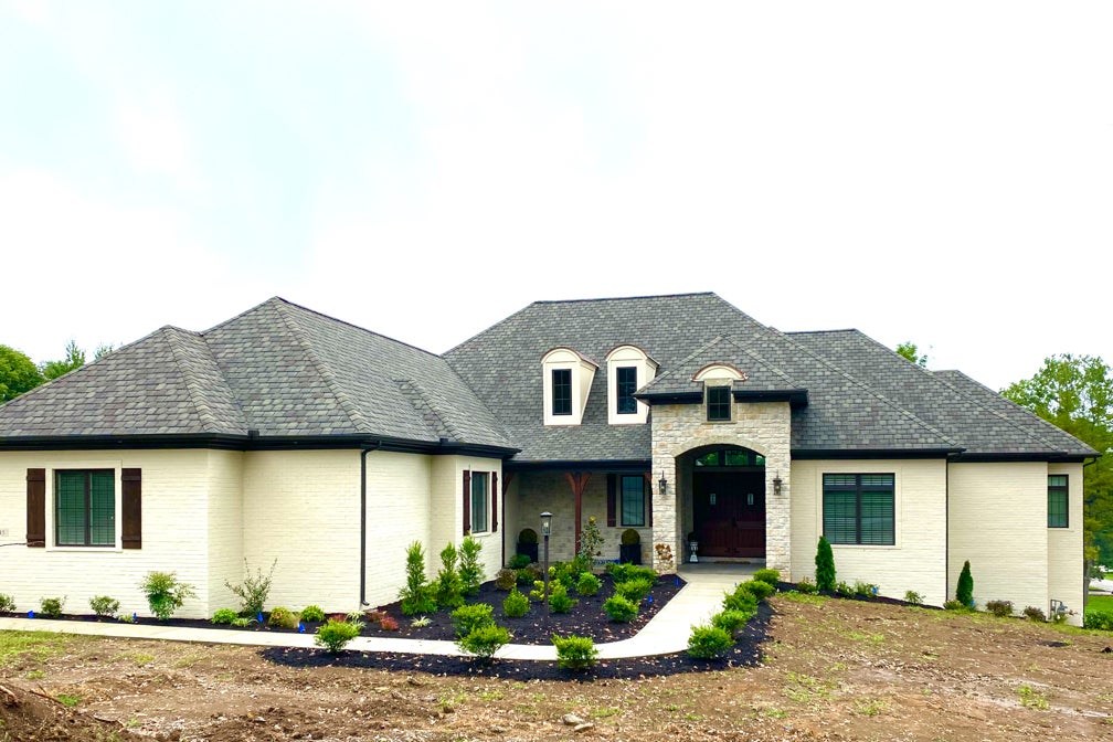
- The Exterior. For a natural finish reminiscent of stucco homes on the west coast, the brick was painted as soon as the mortar was set. By incorporating stone, copper and wood elements the home takes on a comfortable, almost worn aesthetic. Note the curved archways, the bronze window frames, the multi-dimensional roof shingles, the stained bracketed posts, and the stunning iron clad front door.
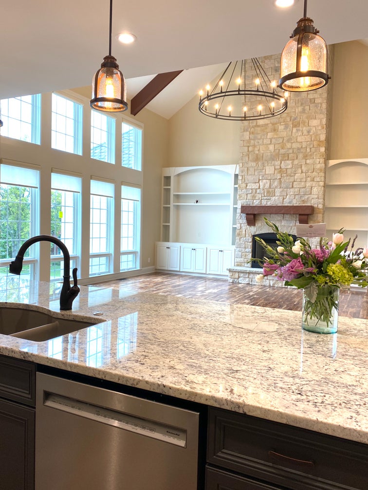
- The Great Room. Grand in scale, the great room uses the design principle of scale to tell a story. The soaring 23-foot vaulted ceiling is grounded by wood beams. The wagon wheel style chandelier fills a void overhead that brings the room down to human scale. Both delicate with its exposed bulbs and sturdy in its iron material, it becomes one of the most interesting features of the large, comfortable room. The stone fireplace provides a focal point and visual weight to the multi-functional great room. The nearby foyer light fixture mimics the great room chandelier without being obtrusive.
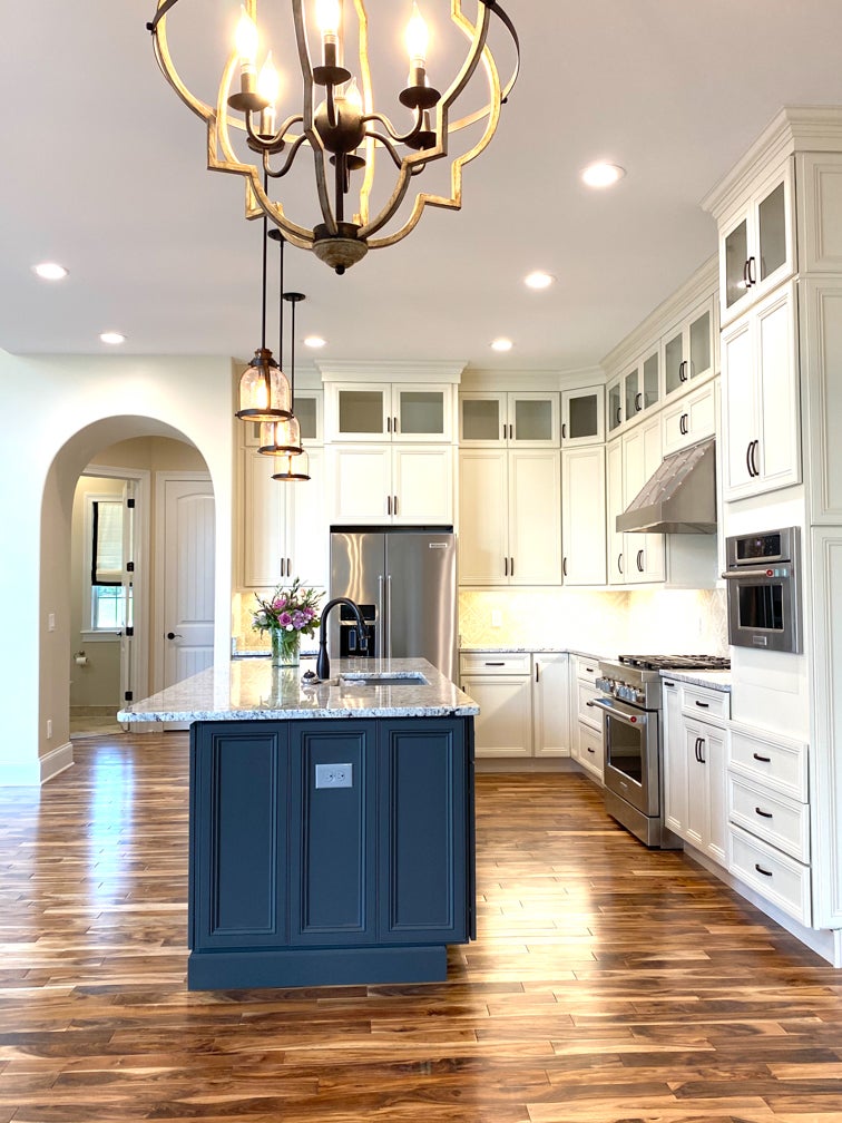
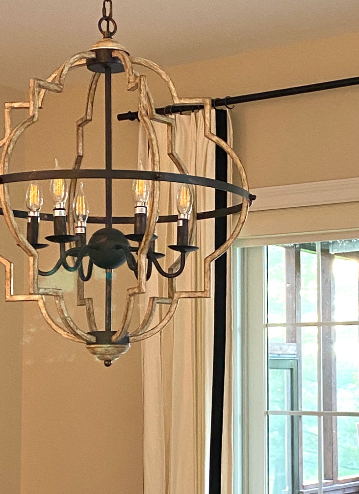
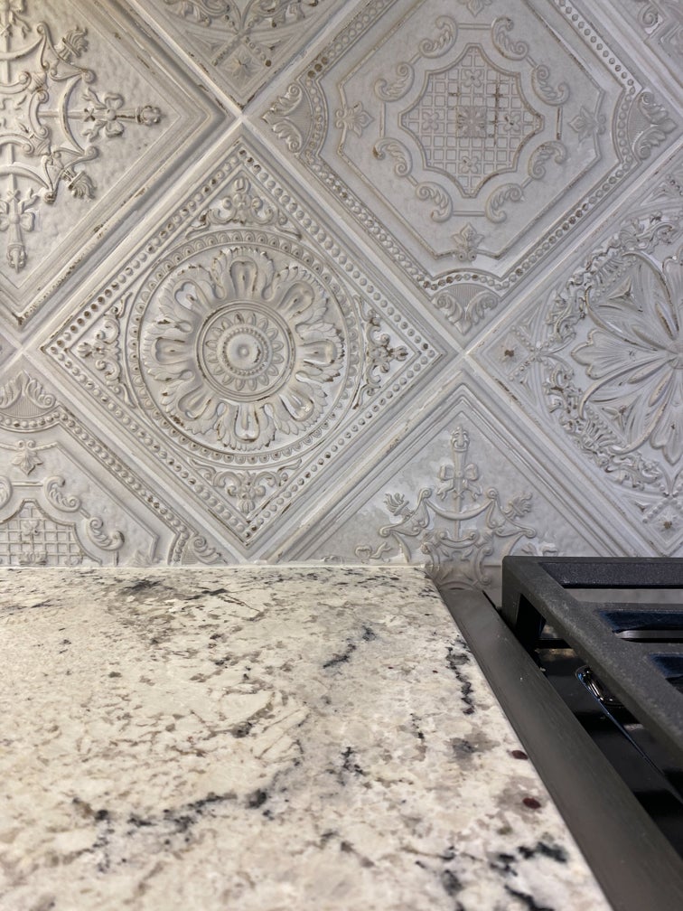
- The Kitchen. Cabinetry provided by Kitchen Creations is styled to fit the California aesthetic. The darkness of the black island helps diminish its place in the center of the kitchen while adding a bright contrast to the ivory perimeter cabinets. The backsplash adds a vintage look and texture. Iron and wood light fixtures that could easily be found in a winery provide visual interest and functionality. A set of soft ivory drapery panels banded in black (sourced through Budget Blinds of Georgetown) frame the porch entry in the adjacent dining area.
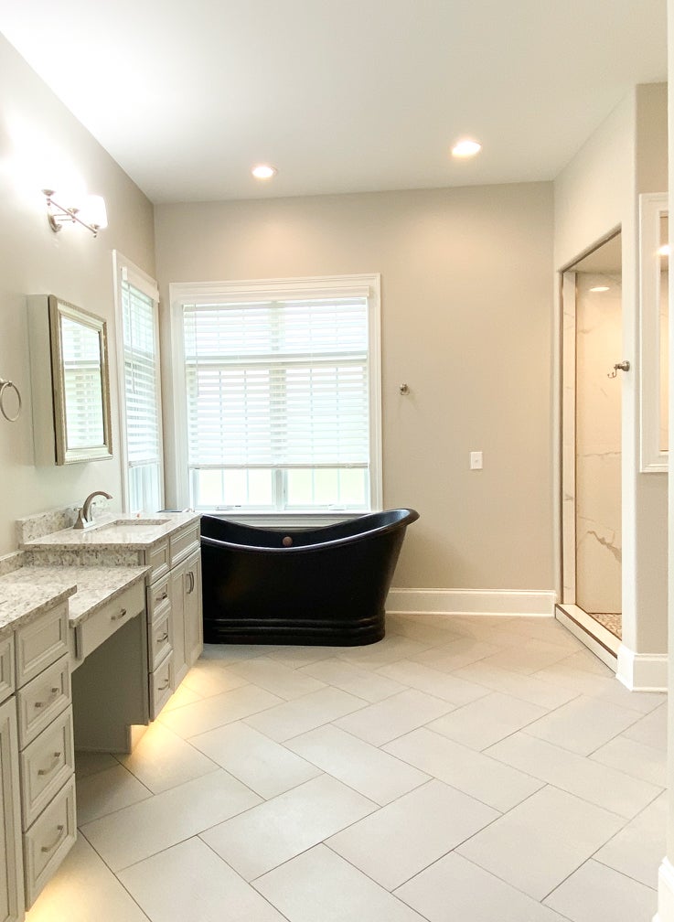
- The Principal Bathroom. The dream of a double slipper tub was on the mind of the homeowner from the very beginning. Because the tub sits above a finished area of the basement the weight of the fixture became a factor in its sourcing. The well-chosen copper version finished in black met all the requirements. Its position in a corner of windows creates a pretty setting. A subtle gray double vanity with built-in added storage provides function and storage. Note the herringbone pattern of the large format floor tiles, and jumbo, vertically oriented tiles used for the walk-in shower installed by Kentucky Tile Works.
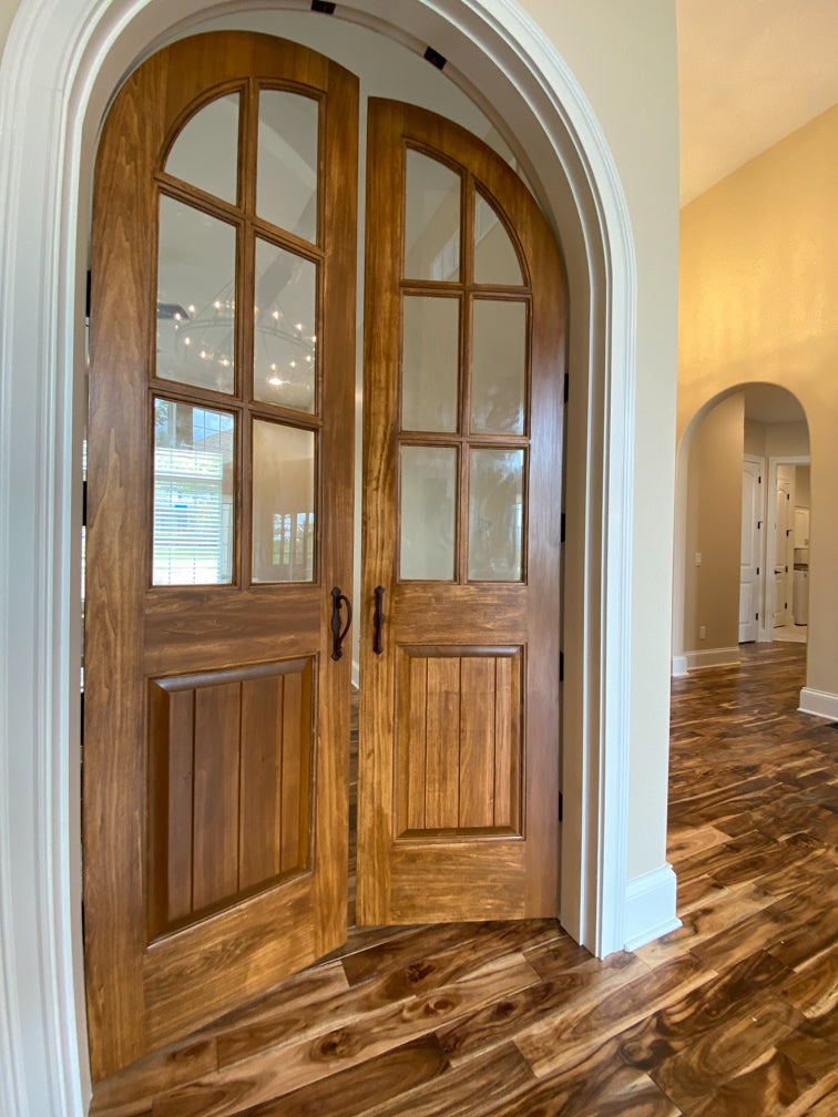
- The Important Details. The repetitive use of arches and archways, in doorways both inside and out, carries the design aesthetic throughout the home. Eight-foot arch detail on interior doorways and eased hallway transition corners are added elements that build character and personality. The wood tone, double front door with heavy iron hardware, combined with the double arched wood tone entrance to the study add significant presence and complete the aesthetic.
