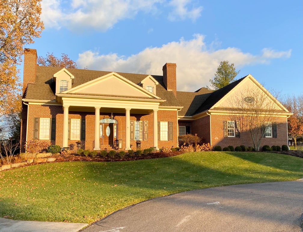
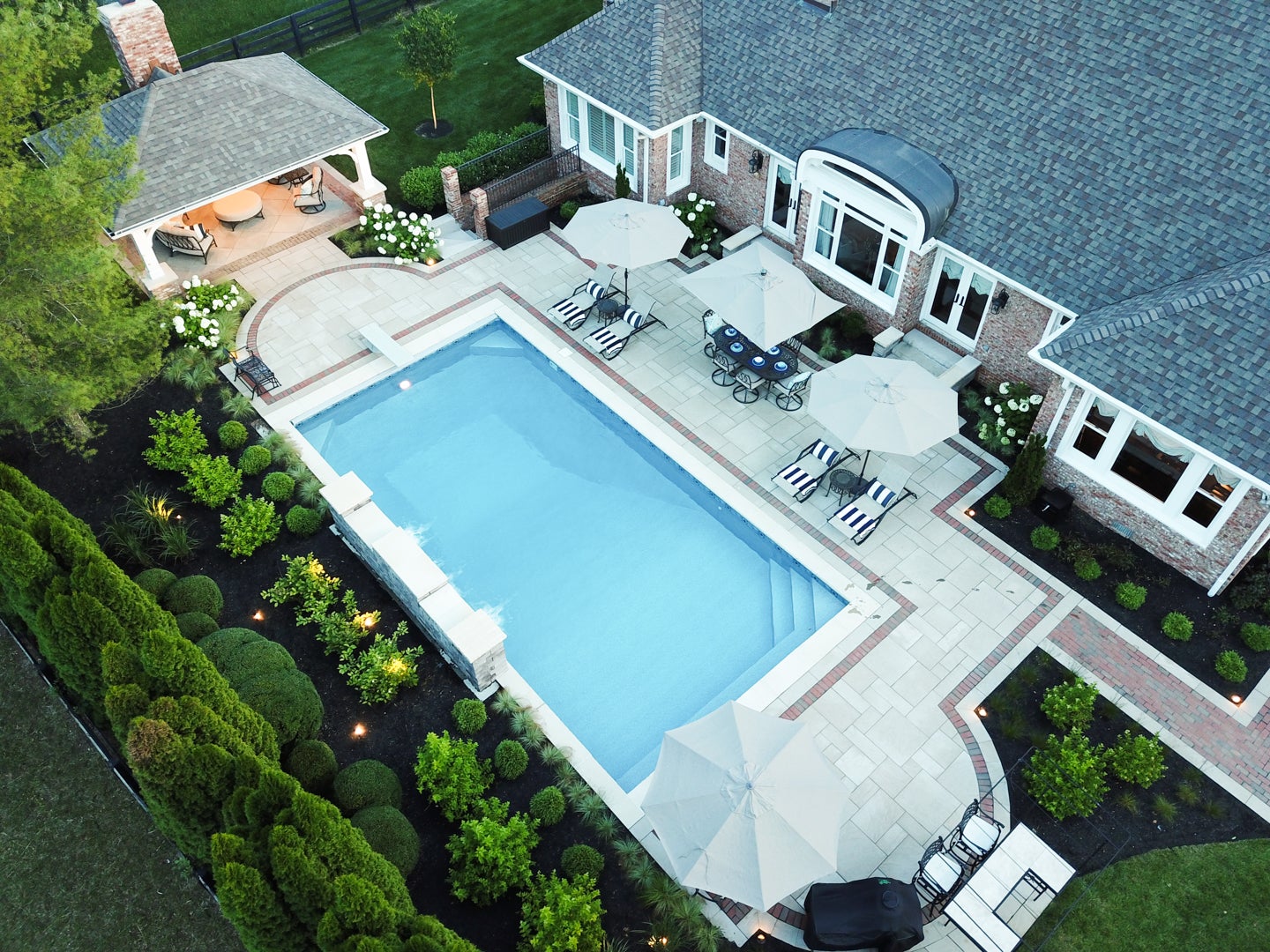
The house at the end of the Woodburn Street is admired by many. It is undeniably stately and classical in its presence. Jim and Mary Simpson are the owners of this beautiful, 4800 square foot, four bedroom home. The Simpson’s have taken on several home improvement projects over the past few years including the expansion of the patio, construction of an outdoor kitchen area, and extensive professionally designed landscaping. The master suite has also undergone a complete, top to bottom renovation. The extraordinary taste of these homeowners shows in every project.
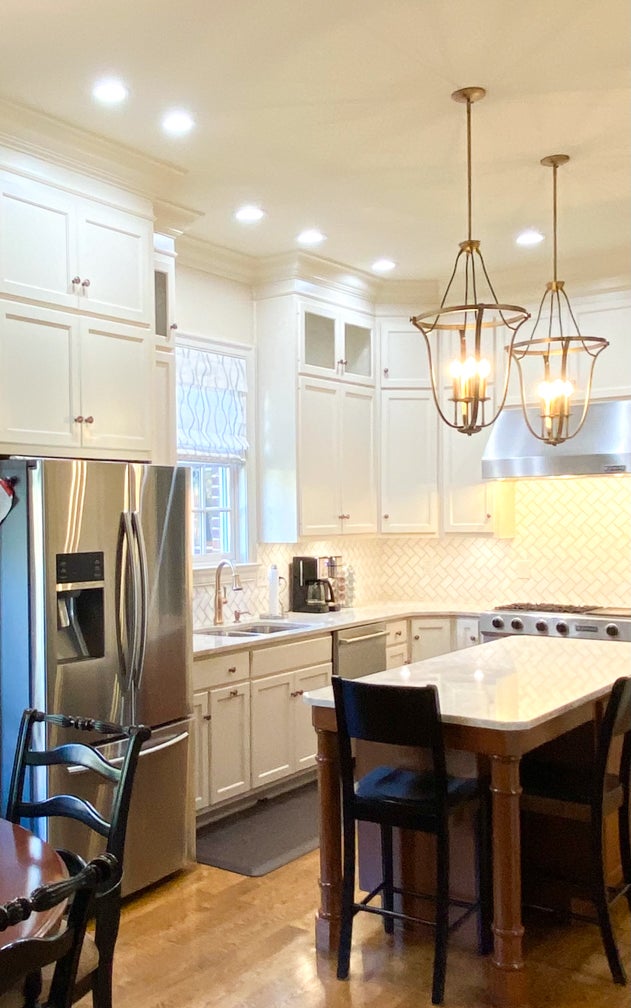
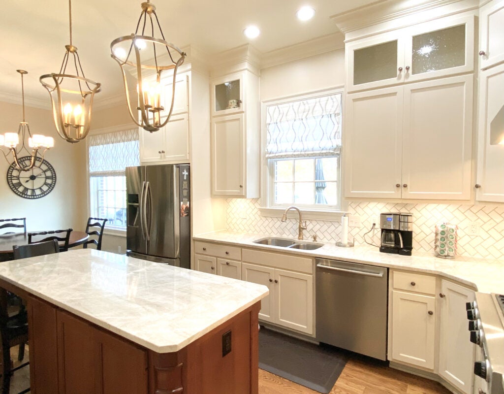
The original kitchen featured high end, traditionally detailed custom cabinetry, but the Tuscan themed aesthetic surrounding it was time worn. By selecting a modern palette of calm hues, highly detailed textures and glamorous gestures, the kitchen now exhibits a soft, comfortable vibe. With the original ivory cabinets left in place, the wall color was brightened (SW Tres Naturale) and major kitchen design elements of lighting, countertops, window treatments, tile and paint were updated. With the help of Mark Morris, of Morris Custom Building, the kitchen was beautifully transformed. The use of modern color in a perfect palette has enhanced this elegant home in a measured, glamorous way.
- Stone. The sourcing of a beautiful taupe and cream quartzite from Global Granite and Marble was the starting point in the design. The Taj Mahal quartzite stone held an immediate attraction to the homeowner. It’s color and striking, yet subtle veining sets a peaceful tone and creates the set up for a soft neutral palette. This beautiful quartzite, expertly fabricated and installed by Counter Culture of Lexington, was also used on the fireplace surround in the adjacent great room to tie the two rooms together.
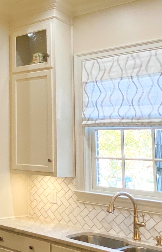
2. Tile. The choice of Jeffery Court Park Place/Gapstow mosaic tile with white honed marble bordered by shimmering polished taupe chips establishes a bright, fresh tone for the backsplash. The tiles are set in a herringbone pattern creating movement while remaining neutral. Undercabinet lighting adds a dramatic sparkle effect.
3. Lighting. The striking large scale brushed gold pendants over the island create a dramatic first impression. By combining these pendants with a similarly curvaceous dining fixture creates a coordinated approach without an exact duplication. Fixed down rods, versus cords or cables, create structure and connection to the high ceilings. A touch of black cording adds interest and a bit of casualness to the fixtures.
4. Windows. Two roman shades in a delicate embroidered pattern of gold, cream and taupe curves brighten the overall space. By tying in colors from the stone and tile, the custom window treatments from Budget Blinds of Georgetown add another layer of warmth and texture. Repeating the theme of curves in the light fixtures, the window treatment fabric keeps the aesthetic thoughtful and interesting.
5. Hardware. Cabinet hardware and plumbing fixtures add enchanting detail and complete the transformation. Not a single detail was missed. From the champagne bronze Delta Cassidy faucet and soap dispenser, to the Schaub French Farm Knobs in Empire Bronze, the palette remains soft, calm and completely on trend.
