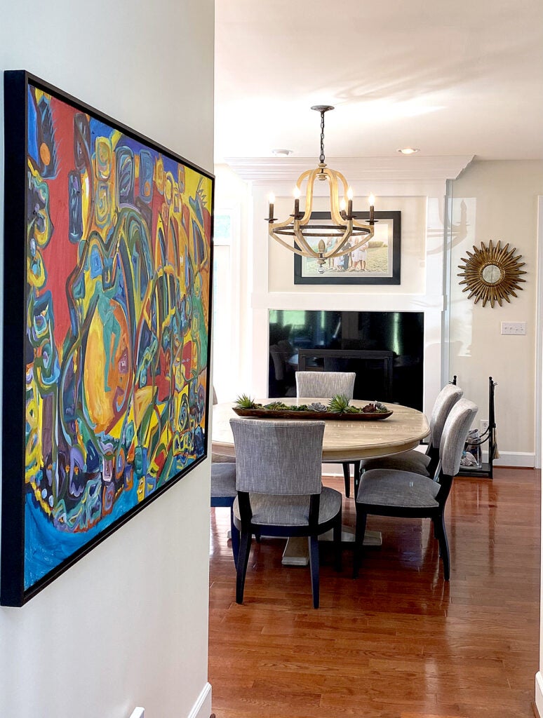
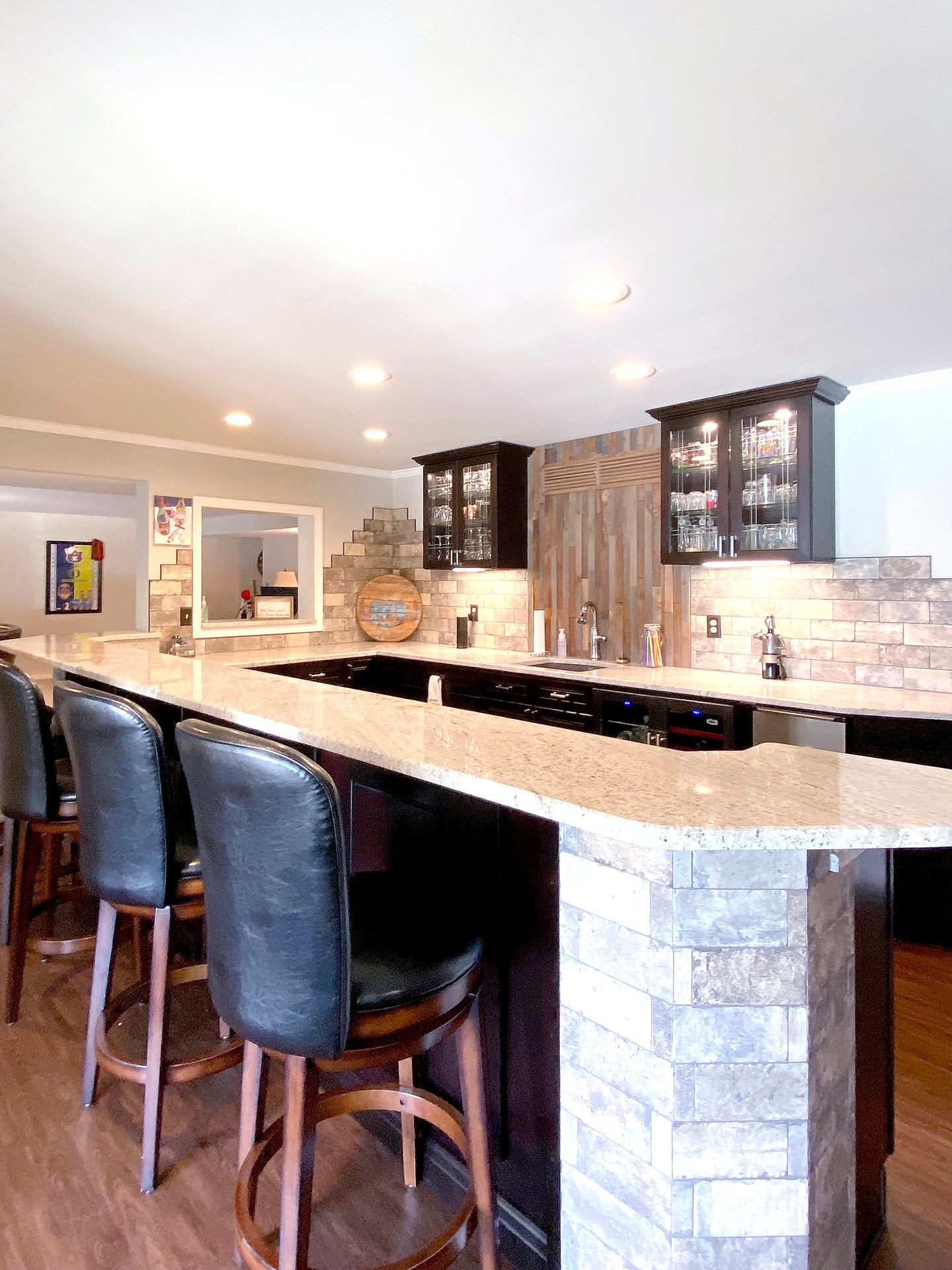
Design is everywhere. From the kitchen project you are dreaming, to the landscaping you need for your yard. You may not notice how much design surrounds us and how it has become a part of everyday living. You may not realize the design sensibilities you’ve absorbed, without knowing. It comes from the continual feed of elaborate design transformations on media sources, like Instagram, blogs and cable programing, and smartly designed restaurants and retail establishments you find yourself admiring.
As someone who works daily with paint selections, kitchen renovations and full-scale home remodels, incorporating big doses of common sense is a major first step. How is your kitchen used and by whom? How does the removal (or addition) of a wall affect the flow of the home? Does the usefulness of a highly personalized wall color outweigh the overall appeal of a room? (Not likely, especially in kid selected colors vs. adult choices.)

Are you courageous and fearless, or a bit timid? The next time you are faced with a design decision, even if you are using a designer, or a design/build company, try using the five listed objectives. These basic, common sense cues will ensure a successful project.
- Be Authentic. Be yourself. Design for your home should be deeply personal. Introduce elements that define your style and aesthetic. That doesn’t mean paint your kitchen walls a bold purple. It means incorporate small doses of purple (if that’s you) through manageable means that can be taken away when the obsession wears off. By the very nature of our technology based world, trends come and go often, and regularly. If you have always loved white kitchens, but see gray everywhere, follow your heart and not the trend.
- Be Brave. There is no need to stress over the color of a wall. It’s a wall, and it’s treated with paint. Paint can be transformative, but it can also translate into an innocent mistake. There is no need to worry because any mistake can be easily fixed. It’s a $60 gallon of paint, not a $100,000 kitchen. Make that first decision. Ask questions if you are unsure, and don’t fear failure.
- Be agile. Be prepared for complications and to make mistakes. Pay attention to what’s around you — good and bad. If you are wise, you can quickly see mistakes and make necessary adjustments. If a complication arises, it’s not the end of the world. Look for options. Second and third options often work out for the better in the end.
- Be open. Learn from others. Be observant of your surroundings. What do you like about that friend’s house, what do you not like? (Be discreet in your comments.) Search home and garden magazines for ideas. You may not find a completely relatable inspiration. Your home is in a different location, it is a different price point, and likely has a different layout. Keep in mind these resources are fluffed up photographs of residences meant to portray a certain lifestyle. Most are unattainable. Many are unlivable (as in comfort). The actual inspiration may be one or two elements, like a light fixture, tile design or paint color. Resources are everywhere, so use them to your advantage.
- Be focused. Look at the big picture. Use the designer technique of observing sightlines. What do you see from various vantage points, from room to room? Does the color follow a natural pattern of tone? Does the theme of the room work with the rest of the house? Pay attention to value. Are you building that $100,000 kitchen in a $200,000 house? Think about your objectives within the big picture? Don’t get distracted by things (or objects) that don’t matter.


