Tom and Brenda Majcher knew it was time to update the kitchen they had lived in for 15 years. Unique for its time, the original kitchen with its highly lacquered cabinetry was designed as part of a custom home built in Two Creeks in 1994. The high-quality cabinetry was crafted by Neff Kitchens, a Toronto based luxury cabinet company.
Investing in good quality cabinetry paid off — total kitchen make-over was not necessary. But after 25 years, there were other elements of the kitchen that needed to be refreshed.
White appliances, stone textured backsplash tile, plus dated countertops, lighting and hardware, convinced the Majchers it was time for an upgrade. While not a totally inexpensive endeavor, new product and design elements befitting a custom home would be chosen to provide a subtle, yet beautiful update to the home.
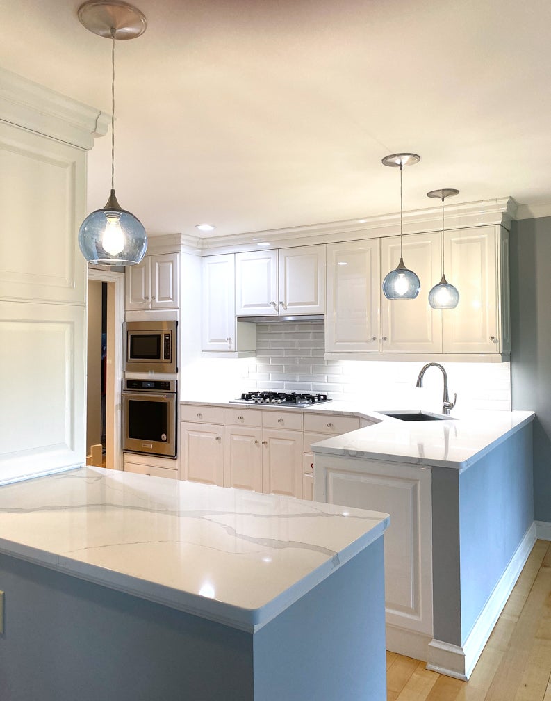
The lacquered finish of the cabinetry allowed light to bounce around the room. Rather than trying to tone down the lacquered cabinetry, as was previously done, the newest design decision played into the sharp whiteness of the kitchen. Primarily white countertops, stainless appliances, glossy white backsplash tile and translucent blue lighting was chosen. These crisp, clean, modern selections transformed the kitchen.
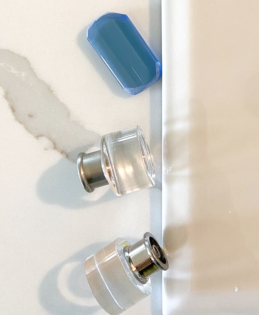
1. Counter tops. Mont Surfaces Venetian Quartz was chosen for its predominately white background and dramatic gray veining that moves through the stone slab. The ease of maintenance and its durability makes any quartz product a good decision. Unlike natural stone, the beautiful stone pattern options of quartz formed in the manufacturing process provide a dependable aesthetic for clients (and designers, alike).
2. Tile. Beveled “Vintage Studio — Mountain Mist” tile by Jeffery Court provides a bright, yet glossy look to the backsplash tile. The creamy white tiles blend in with the cabinetry to provide subtle deliberately colorless texture. The 3-inch by 6-inch ceramic tiles laid in a one-half offset pattern used grout with virtually no contrast to befit modern look for today’s kitchens.
3. Appliances. A full suite of stainless Kitchen Aid appliances provides a high-end look to the kitchen. The sleek side by side refrigerator provides a modern look. The double wall oven/convection/microwave oven set keeps baking functions in a centralized area. The touch of black on the handles and controls adds a foundation needed to balance the stainless finishes.
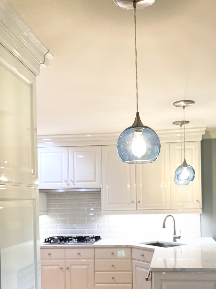
4. Lighting. Artisan pendant lights from Bicycle Glass Company were selected for their transparency, while adding color to the monochromatic design. The three single blue pendant lights coordinate with a cascading 3-light dining chandelier in the same sparkly blue glass. Crystal hardware was used on the cabinetry to further tie in a glass-like aesthetic.
5. Floor. Original to the home, the kitchen floors are a natural (unstained) wide plank maple. The newly finished floors look bright and fresh as new as the other kitchen upgrades.

