No home is ever stagnant. As families evolve, homes evolve. A home providing an ideal layout for a young growing family becomes a home with new purpose for the parents when the nest is empty. A Jack and Jill bathroom for two daughters has evolved into a more mature guest bath. With the rarity of having both adjacent guest rooms occupied, the bathroom could be redesigned into a new space. A luxurious bath suite that feels modern and visually spacious without a change in square footage.
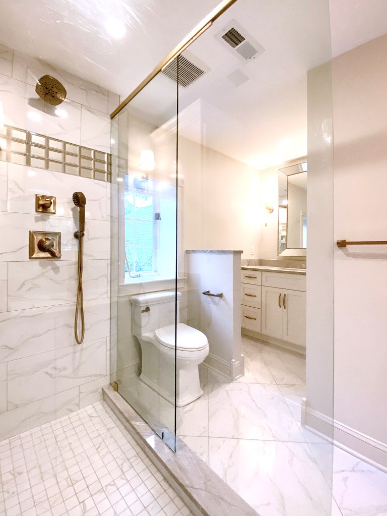
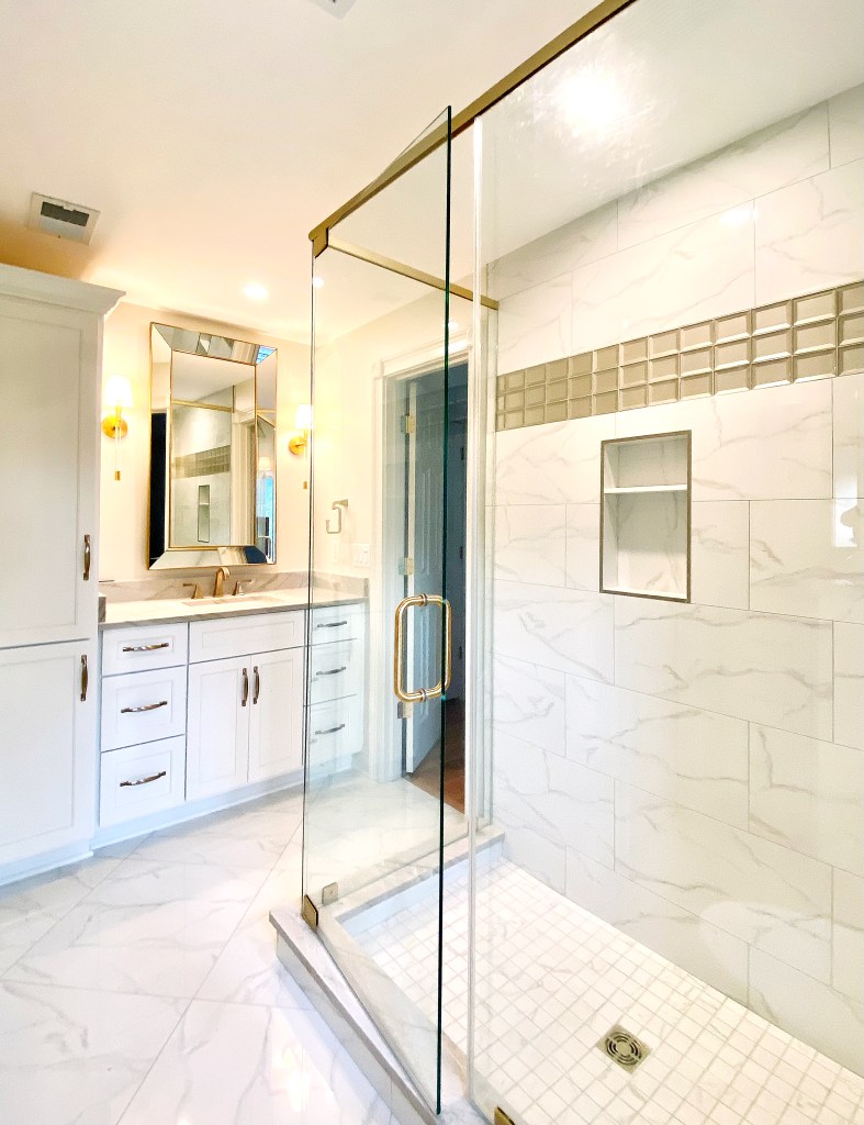
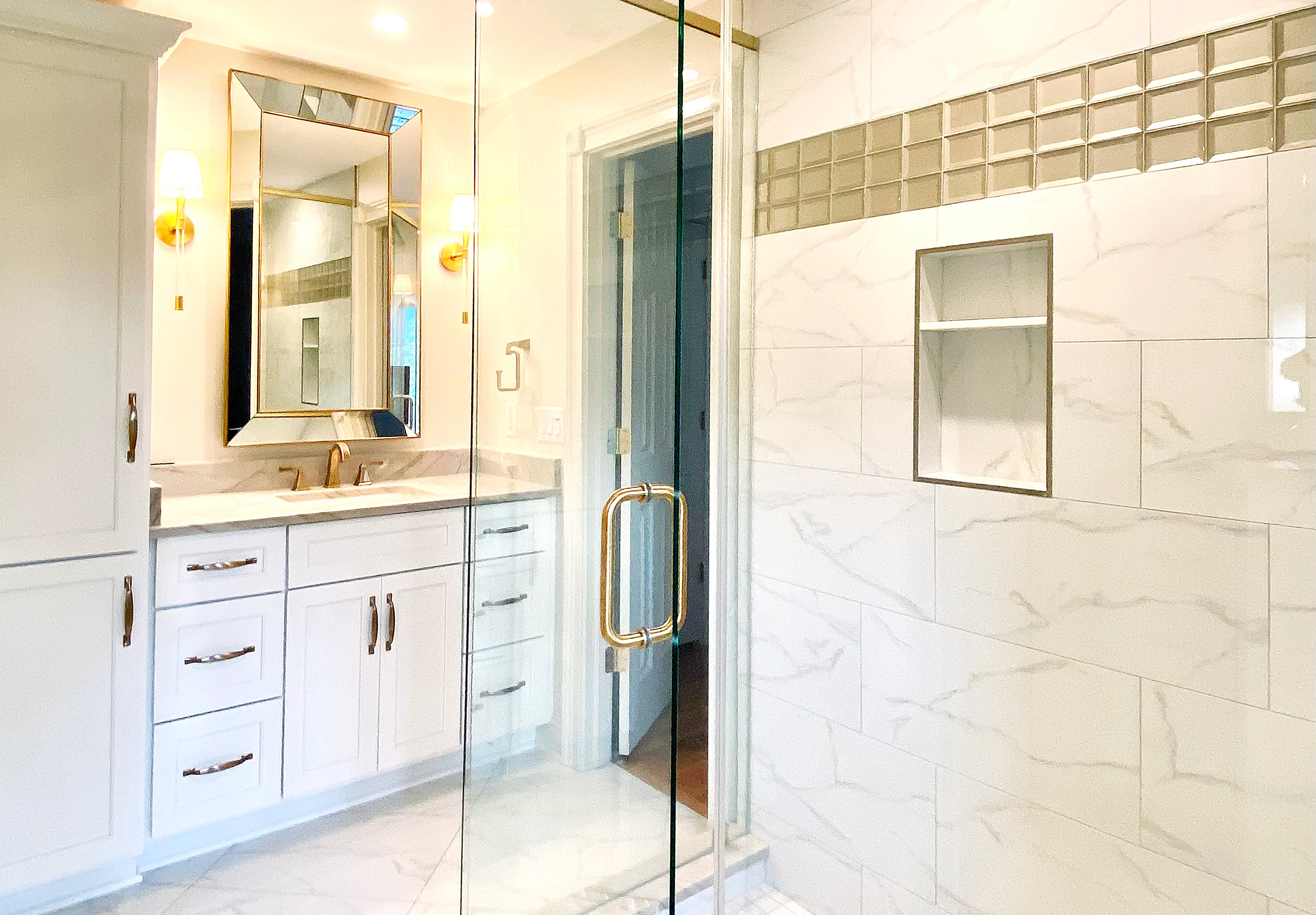
By eliminating two of four privacy doors, and two walls around the shower, the design creates a bright, more open aesthetic. While a small window provides a lot of natural light, the room was brightened even more with warm white paint. By keeping the cabinetry materials, walls and trim a calm neutral tone, simplicity was created in a complex space. The natural quartzite stone provides textural interest. Brilliant, champagne bronze plumbing fixtures add sparkle but remain as a non-contrasting neutral in this curated spa-like space.
As your home evolves with you, think about new purpose for each room. Design these new spaces to reflect what you want those spaces to become.
- Walls and doors. To remove the visual barriers of this Jack and Jill bathroom, two interior privacy doors were removed. The entire bathroom is now open but maintains dual access from adjacent bedrooms. To further add to openness, the walls surrounding the shower were exchanged for a full view glass enclosure. A single wall that blocked an interior view was taken down to a half (pony) wall to leave some privacy for the toilet area but create a new sightline through the entire space. Users still have the option of one of two vanities (as in a double vanity primary suite), but what was a closed central area is now open to both vanities.
- Finishes and texture. The goal of creating bright, open spaces was accomplished with white. The cabinetry for the two vanities and the built-in linen storage are painted a soft white. The walls, painted Sherwin Williams White Duck, provide a subtle contrast to the cabinetry. Continuing SW White Duck on the trim and baseboards adds simplicity (vs. contrast) to the high function space. Delta Champagne Bronze plumbing fixtures provide a bit of glamour. The neutral toned Quartzite used on both vanities tops and the shower curbs adds warmth.
- Lighting and mirrors. Four aged brass sconces with Lucite accents from Visual Comfort provide elegant function without being heavy. The twin, large scale, beveled framed mirrors from Restoration Hardware provide visual structure and balance. Recessed can lights, placed precisely overhead, provide a second source of light and optimal function.
- Tile and glass. The same high gloss porcelain tile pattern was used for both the shower and the bathroom floor. Using large format 24-inch square tiles set on a diagonal on the floor and large format rectangular tiles set in a one third offset creates consistency in color and tone but establishes interest in pattern. Shiny beveled glass tiles in the niches and as a decorative border adds more shine. Full view glass shower walls and door keep the room clear of busy sight lines.
- Teams and Vendors. Complex projects like this Jack and Jill bath conversion require top notch teams. This project was accomplished through the work of: Terri Bennett, Terri Bennett Interior Design; Ben Harp, Harp Design and Construction; Greg, Barber, Barber Cabinet Company; Jason Judd, Rodgers Flooring (Versailles); Ernie Bowman, Painting; and Mark Wright, Dunn Wright.
