and Becky Gatewood
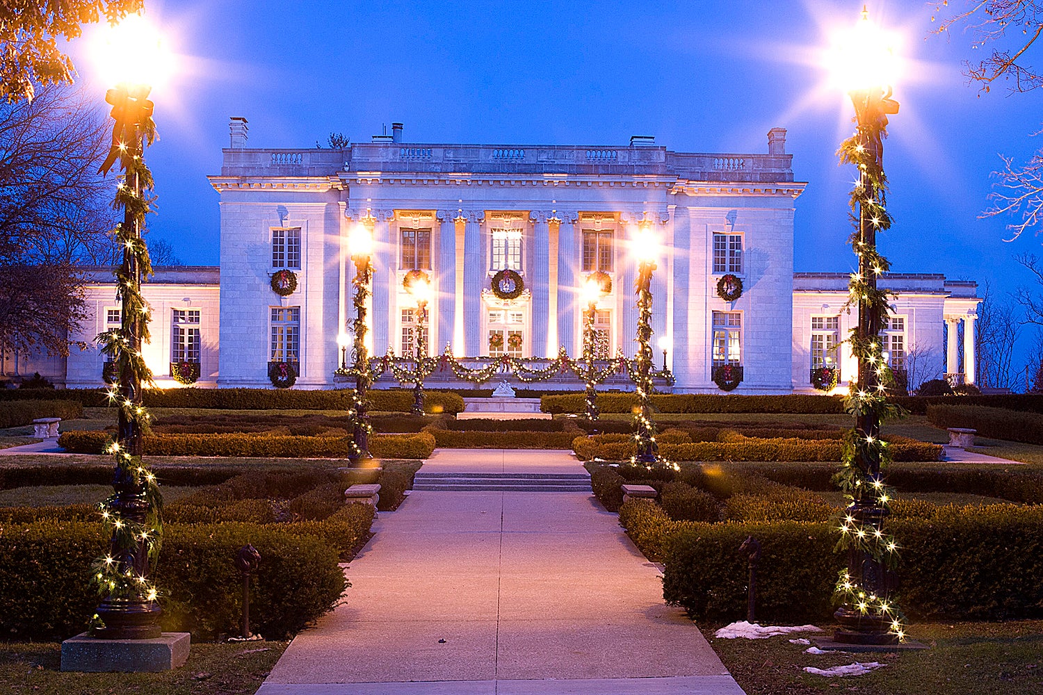
If you flip through the pages of a landscape design magazine or book, chances are you will see the dreamy terra cotta and goldenrod-colored estates of Provence or perhaps images of a lakeview home complete with boathouse and tree lined allee. Not everyone has that kind of space, nor do some people even want that much. An attractive or even spectacularly stunning landscape does not have to be large. Well-designed small spaces can embody just as much beauty and purpose.
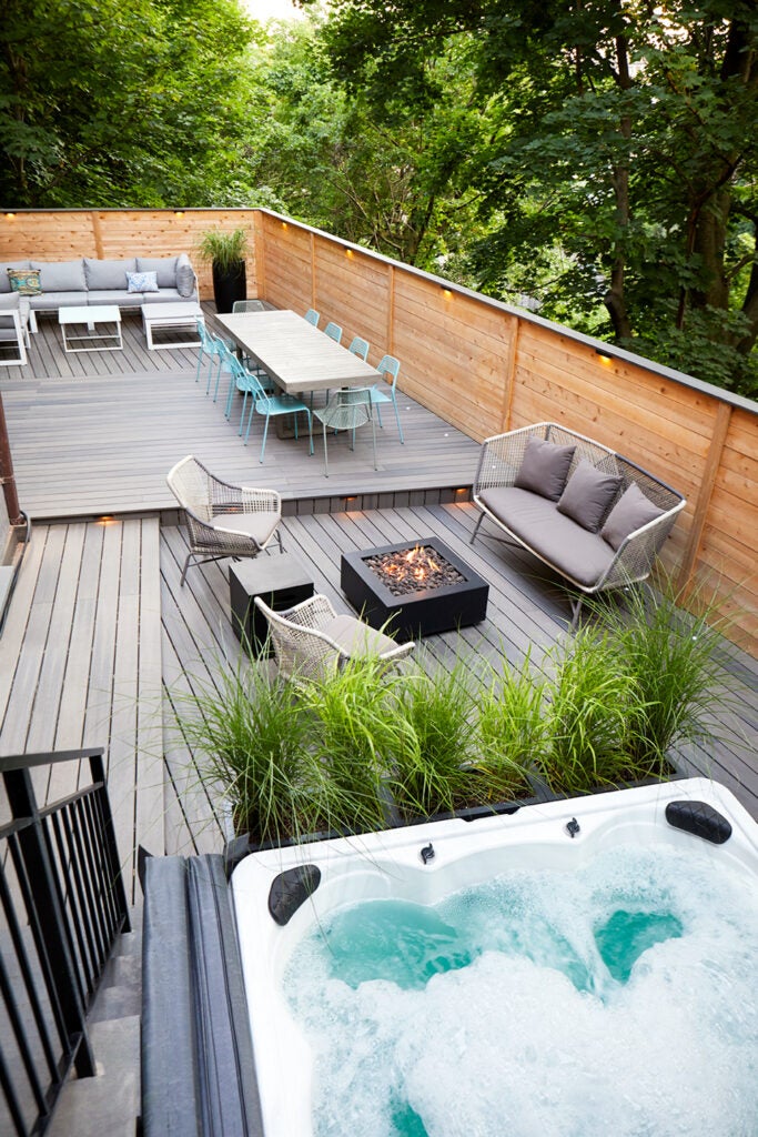
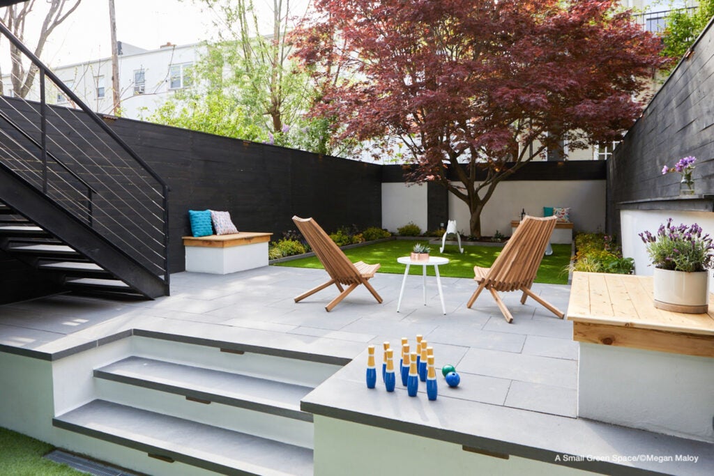
From narrow urban backyards to front courtyards and from fencerows to entry gates, there are many different types of small spaces. Designing in a small space requires thinking outside of the box while also maintaining a strong focus on efficiency. This can be an advantage to a designer who enjoys a good challenge and discovering new ways to use materials. There are likely just as many approaches to designing a small space as there are types of small spaces. Let’s look at a few of the most successful ones.
Some say “go vertical or go home,” but unfortunately it is not that easy. Vertical elements draw the eye upward making a space feel more open, but this doesn’t mean that surrounding your small backyard with a tall solid privacy fence will create a larger feel. Introducing vertical elements that are a bit less predictable, such as a sculpture, narrow tree, trellis with greenery or water feature, directs the eye upward and out of the space. When properly placed, vertical components make the outside elements feel like part of the inner space. Eye movement in general makes an area feel larger.
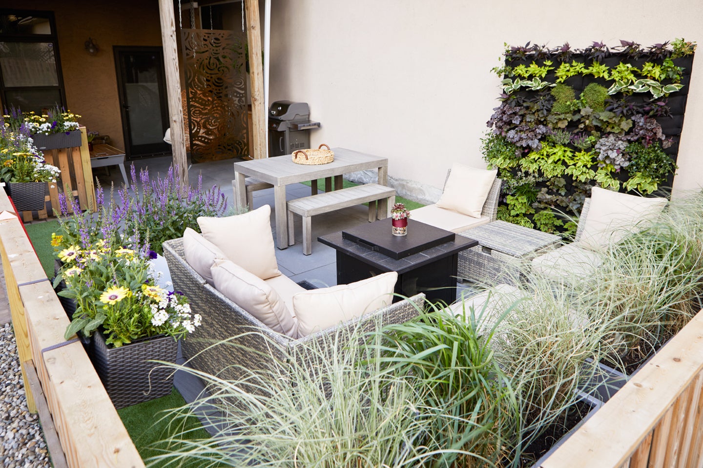
Be smart with useable space. Commonly we overlook objects that are familiar to us and do not realize their potential to have multiple uses. An outdoor bench, if designed efficiently, can easily do double-duty as wood storage around a firepit or for stowing away yard tools. Vertical or wall gardens are also practical choices for a small area such as an urban backyard because they are an efficient use of space and allow something like a wall or fence to serve a dual purpose. A vertical plant area also introduces texture to keep the eye moving.
Clean lines draw the eye forward. Clutter can make any space feel small, and not just physically. Eye movement may make a space feel more expansive, but when there are too many elements, the eye jumps from one to the next creating a sense of confusion and instability. This is one reason designing in a small space can be difficult. It requires just the right amount of visual activity without overworking the senses. Designing with correct proportions and along a relatable, architectural axis play a large part in creating a clean line of sight. As long as elements are balanced, focus can be maintained even in a complex design.
Focus on focal points. A landscape or hardscape element does not have to be vertical to work well in a small space. Horizontal or ground level elements can work just as well. Don’t build a yellow brick road, but think along those lines. Our eyes are drawn to the brightest elements, and this doesn’t always mean lighting. Varying textures and placement of hardscaping can also serve as a focal point to direct our view.
Don’t underestimate the potential for your small spaces to have meaning. With the right design elements, the possibilities may surprise you. Even though there is no room for frivolous in a small space, that does not mean there isn’t room for something creative and detailed.
