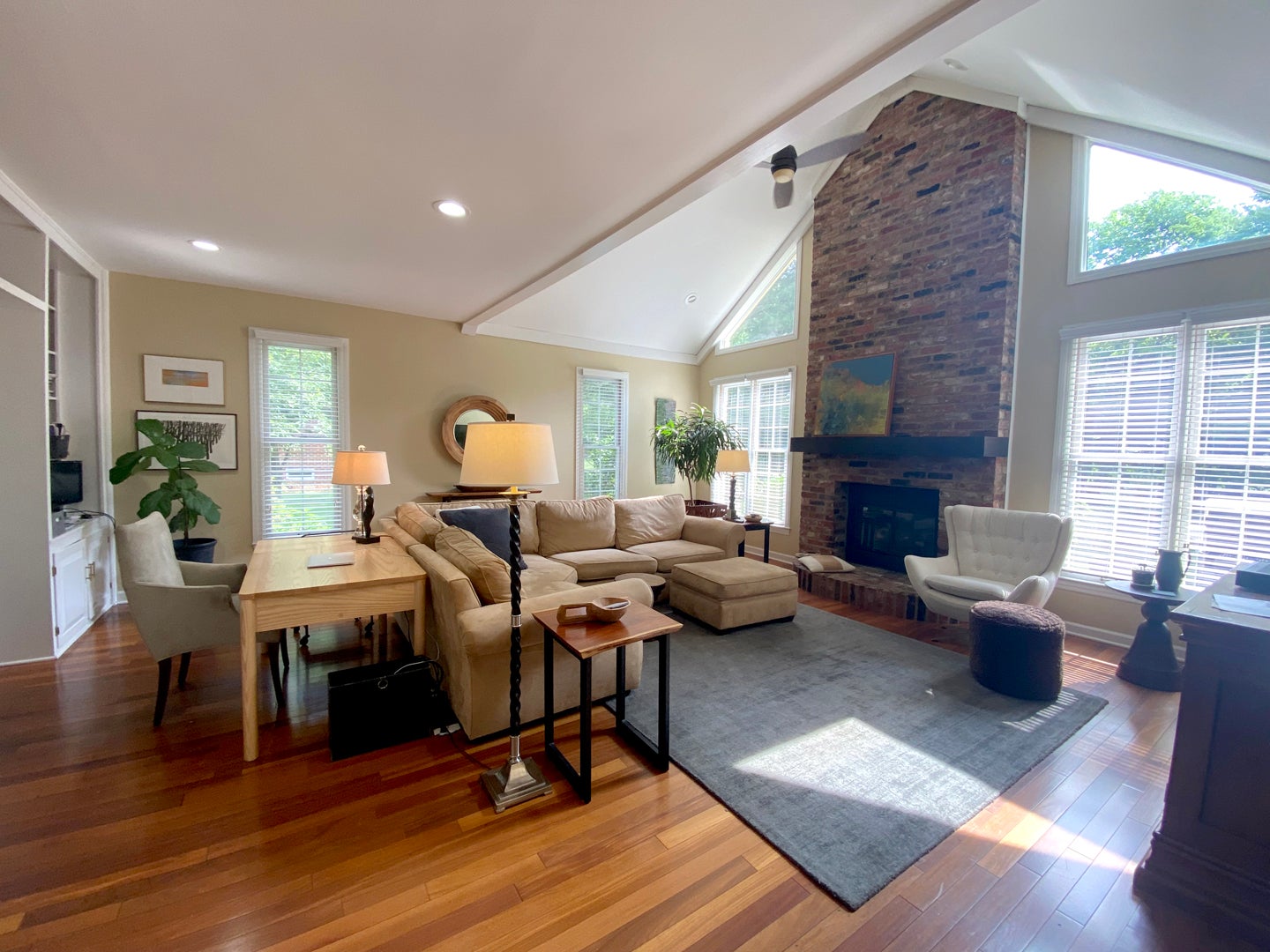
A recent remodel of a traditional two story home in Two Creeks is wonderfully personal. The young, active family knew when they purchased the home in the Spring of 2020 that the home would undergo significant changes to reflect their personal style. All aspects of the renovation, inside and out, were designed and guided by the homeowner, with the aid of Patrick Cleveland, with his father, Murray Cleveland, serving as general contractor.
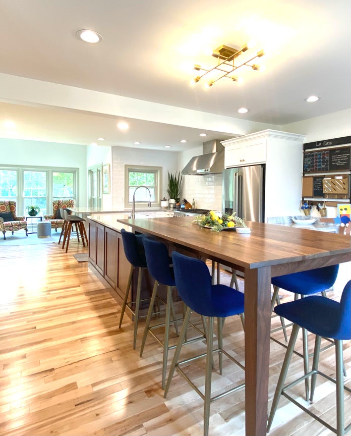
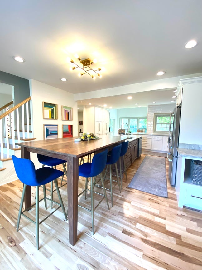
The most significant change was the design of the kitchen. What was a dark, cramped kitchen has become a beautifully expansive family gathering area. Walls and doors were reconfigured to create a multi-purpose space. To create the unique layout, space previously dedicated to a formal dining room was incorporated into the new kitchen. The addition of a custom-made walnut table cantilevered and supported by the large island creates dining seating within the space. The expansive room now occupies square footage that runs from the front of the home to the rear where it terminates in a bright comfortable seating area.
The white walls set the tone for a modern aesthetic. A contemporary modified Sputnik brass light fixture further adds to the youthfulness of the space. Following a guide of using a darker, walnut finish helps the large island recede from view while providing a transition to the table. Bright white perimeter cabinets with large scale brushed nickel handles set the tone for the room. Bright color is incorporated through furnishings and art.
The unique layout, brightness of the white walls, modern finishes and the sparing use of color defines this transformation. The home now reflects the youthful spirit of its owners.
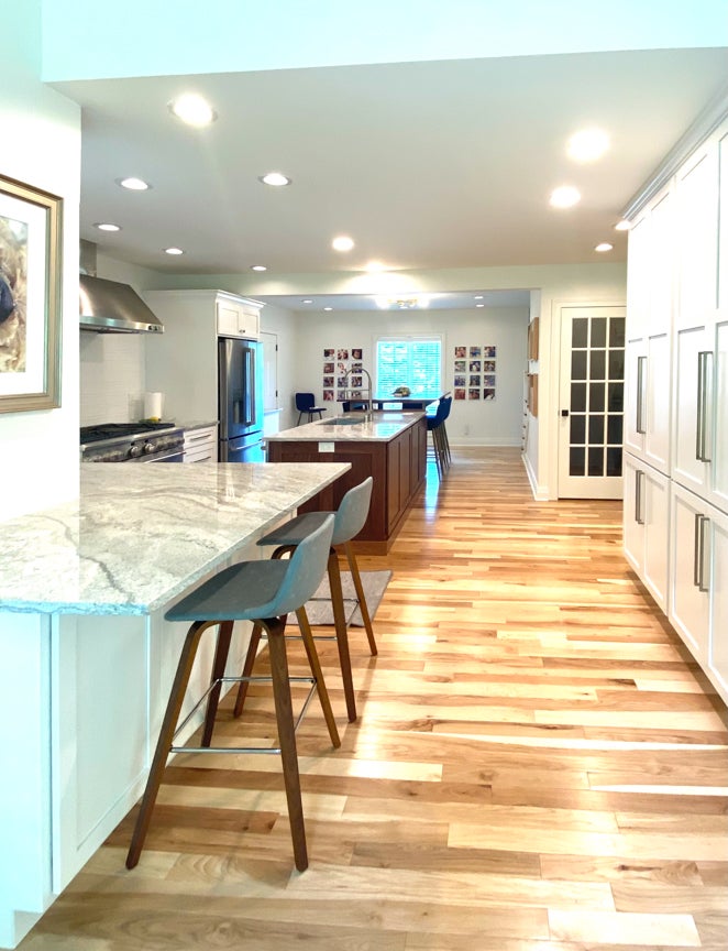
- Layout. By removing a wall between the original kitchen and the formal dining room, the new kitchen space becomes an expansive multi-use room. Simply relocating a door into the garage provided the continuity of a single wall to support appliances. The spacious room now accommodates an efficient work triangle, casual dining, pantry storage and in-kitchen seating.
- Cabinetry. Custom cabinetry from Heirloom Custom Cabinets in walnut for the island and white painted finish on the perimeter cabinetry provides ample storage. The Shaker door and drawer style keeps the cabinetry from being overly fussy. The family dining table that seats seven and was designed to cantilever off the large island. Coordinated cabinetry in the adjacent great room provides bar setup.
- Flooring. Dramatic, prefinished Hickory hardwood runs throughout the first floor. The light, natural color tones and high wood grain conforms to the modern aesthetic.
- Finishes. White walls painted Sherwin Williams White Dove provide a bright backdrop. The light “White Thunder” granite, provided by Lexington based Counter Culture Plus, has dramatic sweeps of veining that works well with the high profile glossy white 3-inch by 12-inch tile. The mixed metal concept of satin nickel for the cabinet hardware with brushed brass light fixtures adds interest.
- Appliances. The homeowners chose the chef inspired GE Café line of appliances for the range and refrigerator in stainless. This line of appliances was designed for style conscious homeowners who want a distinctive look with practical features for home kitchens.
