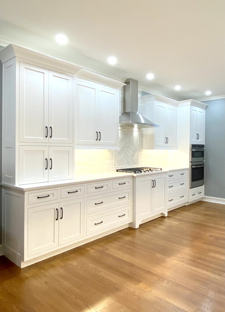
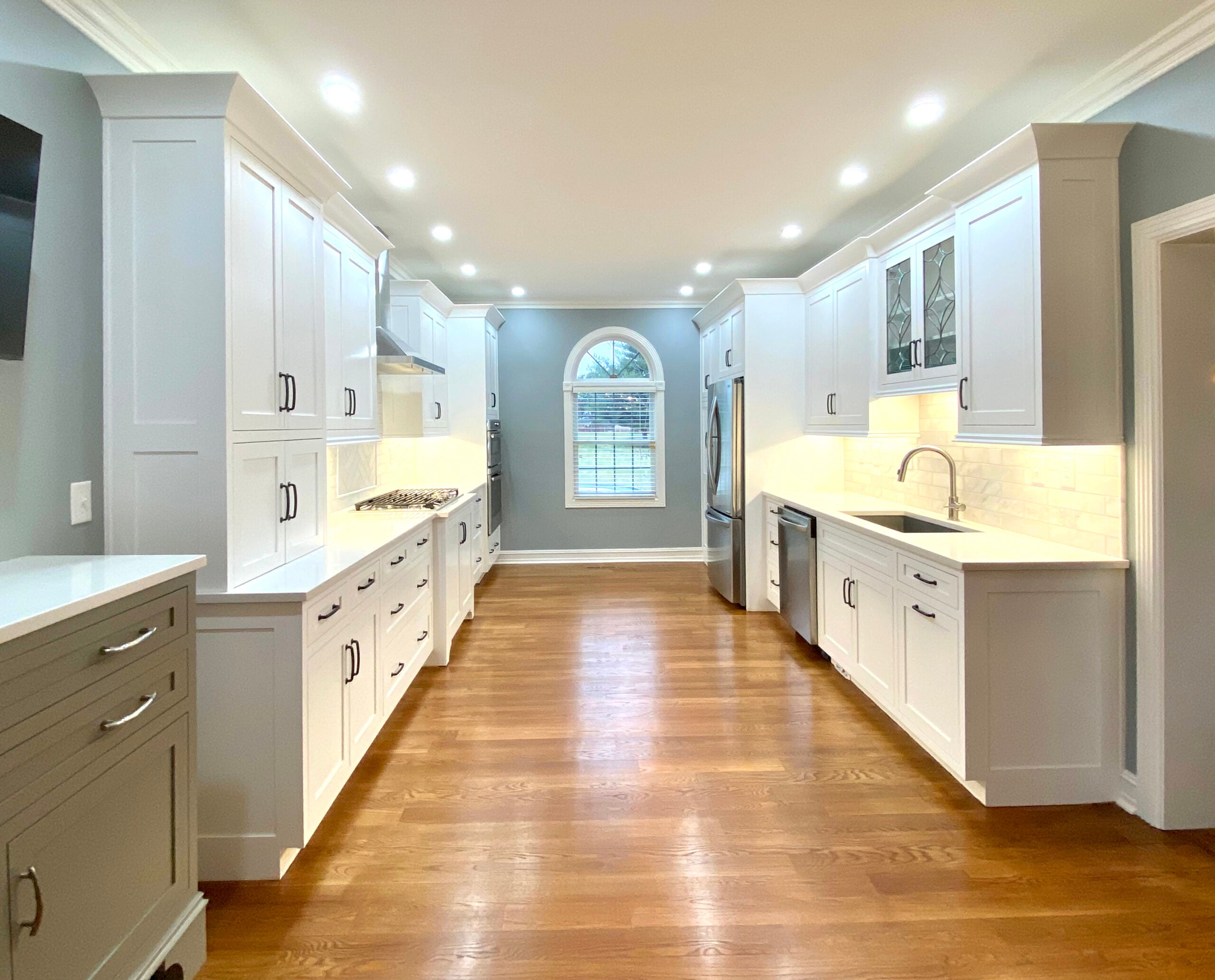
There is no kitchen style more admired than a classic white kitchen. A well designed white kitchen survives trend after trend in kitchen design. The owners of this nearly complete classic white kitchen were looking for an option that would correct an awkward layout and aging cabinetry. A functional remodeling of the space now provides a perfectly bright white alternative.
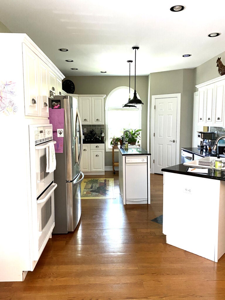
While the original kitchen was white, it exhibited cabinetry that was more than a little short in reaching the status of full height cabinetry. There was a small island that was intrusive and not functional. The sink was built into an angled peninsula that took valuable square footage out of the room. Dropped pendants acted as a division between areas within the work zone and black countertops provided high contrast in a space begging for a brighter story. The solution was a complete redesign of the work triangle that improved the overall function of the kitchen. This new layout, combined with crisp white materials and surfaces, creates a beautiful classic aesthetic.
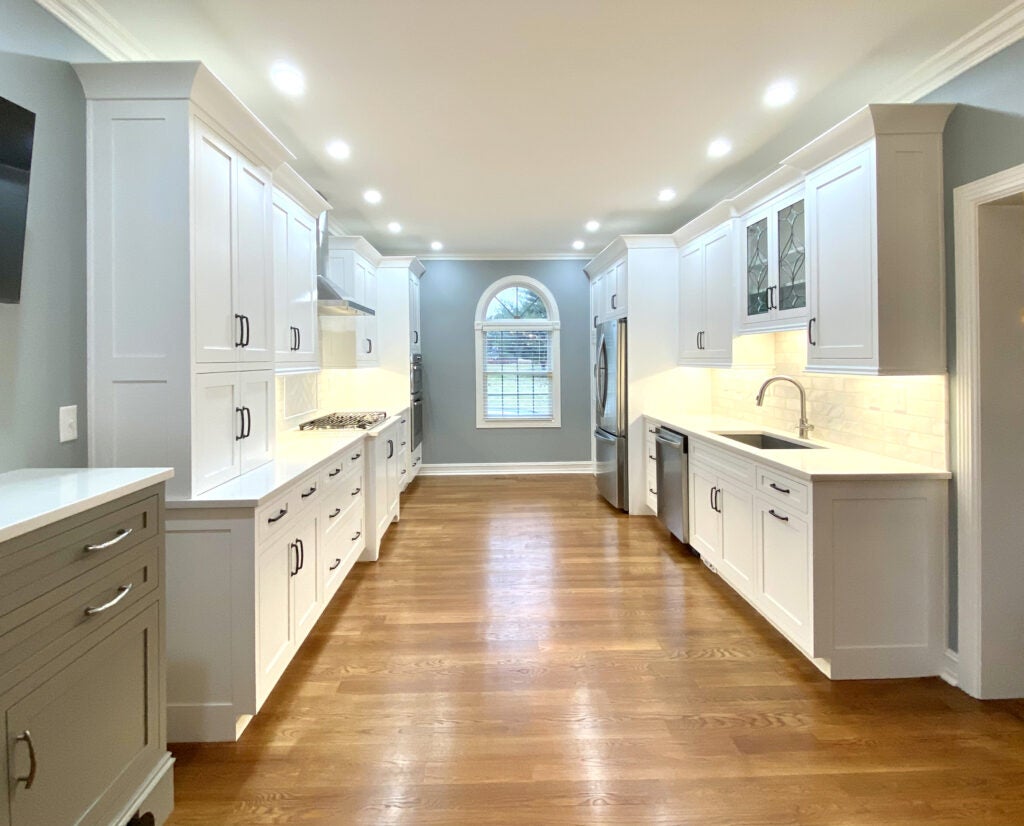
By eliminating the obtrusive island and straightening the peninsula the kitchen feels larger. Even though an island is not part of the new layout, the actual amount of work surface increased, which translates into the notion that an island is not always needed. The incorporation of deep, wide drawers changes the usability of the base cabinetry. The pantry is now integrated into a line of cabinetry and accommodates more storage than the previous pantry. The incorporation of leaded glass detail over the sink adds an element of personality and interest often forgotten in all white kitchens. The fresh blue gray walls (Sherwin Williams — Mineral Deposit) helped brighten the room. The result is a classic white kitchen with layered style.
- Layout. The small island in the center of the original kitchen was an obstruction to functionality. The awkward peninsula and its random placement took away valuable square footage and created a visual blockage. The redesigned kitchen aligns everything on one of two walls. The work triangle was simplified and made more efficient — without an island. Ben Harp Design and Construction provided both the demo and reconstruction completed on the kitchen.
- Cabinetry. Custom cabinetry from Barber Cabinet Company provides elegance. By choosing inset doors and a simple shaker door, the design comes across restrained, yet stylish. Rather than choose the standard soft or off-white option, the homeowner chose a bright white finish to bounce light around to room. Gun metal gray hardware provides contrast.
- Countertops. While keeping with a white-on-white story, the Metroquartz Casena quartz — with a slight gray veining providing subtleness — was provided by Counter Culture Plus. A charcoal gray undermount composite sink adds a custom touch.
- Tile. White kitchens work when there is a layered effect. The tile backsplash provided by Louisville Tile in 3×9 white marble provides a polished look. Note: the tiles are set in a herringbone pattern under the exhaust hood and horizontally along the walls. This provides pattern, texture and interest. By mimicking the quartz countertops in the colors of white and light gray, the hard finishes are coordinated and complimentary. Ryan Dawson of Kentucky Tile Works provided the tile installation.
- Detail. To add personality to the kitchen, two pieces of leaded glass were incorporated into the cabinet doors above the sink. This sentimental gesture comes from a gift to the homeowner’s mother. The inclusion of a bar cabinet finished in a soft gray also adds personality to the all-white kitchen. It serves as a functional piece in two ways by providing bar service access for guests and by supporting a small television used on a daily basis.
