In 10 years, my husband and I claim five different addresses as our home. Longevity just hasn’t been our mode when one of us enjoys, both professionally and personally, the process of renovating and designing homes. The South Creek home was never intended to be a lasting destination.
After losing out on a contemporary home we had under verbal contract, we purchased the South Creek home. The expected path of renovate and sell has now changed. It wasn’t just the availability of nearby Elkhorn Creek, or the transformation of the exterior with the painting of the brick. What has finally captured our attention is a spacious new kitchen.
The recently completed kitchen remodel solved problems left by projects completed by previous owners. Each one was an attempt to personalize the kitchen of this 40 year old home. But the real issue was never addressed — the need for improved clearances and more space.
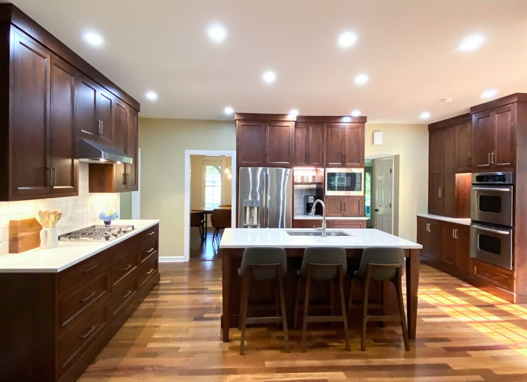
With two cooks in the household, functioning workspaces was the primary goal. The process involved re-imagining the space to gain much needed square footage. Removing one of two coat closets and pushing back a wall allowed the original island to rotate 45 degrees clearing up visual and functional space. Design choices remained consistent with the style of the home and the personalities who occupy it — our comfortable, casual selves.
There were no extravagant temptations. No trendy selections. While deceptively simple in its aesthetic, there is a handsome elegance built into the details. By remaining focused on our lifestyle, the project transformed the house we bought into the home we made.
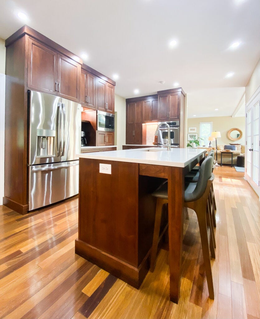
- The Layout. By adding 4 feet of previously wasted hallway space, the kitchen gained double the square footage in function and in visual space. Ben Harp of Harp Design and Construction was used for demo and reconstruction. One short wall of the original kitchen was pushed back to create new square footage. The work triangle now has occupants moving easily from task to task. Food storage is nearby, but away from the cooking zone. The large island accommodates spectators and cooks.
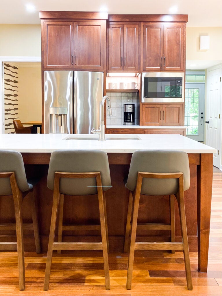
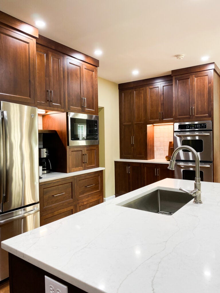
- The Cabinetry. While the new layout of the U shaped kitchen is fairly straightforward, Greg Barber of Barber Cabinet Company provided aesthetic suggestions. Knowing the kitchen needed to fit the personality of the home, subtle design details were incorporated. Inset drawers and doors keep dust and food from landing on the tops of the doors and drawers. Rather than the expected fussy crown molding, a correctly scaled flat crown balanced by flat base boards (in lieu of dirt gathering toe kick areas) creates a stately appearance. Opting out of the basic shaker style, subtle detail was added to the deep drawer and door panels. Elegant, tapered legs were added to the island support.
- The Finishes. The walnut stained cabinetry, wood tone floating shelves and the drama of Brazilian teak patterned floors, defies the current trend of gray and white painted finishes. Using wood tone cabinetry creates a custom furniture look. The dual wood approach of the cabinetry and the floors creates warmth and richness. As a counterbalance, lightly veined Vadara Sereno Quartz from Counter Culture Plus was used on the countertops, along with 4×4 Anthology Moroccan Habitat “Canvas Zellige” tile laid in straight stack format was used for the back splash.
- The Appliances. Avoiding Pinterest and Instagram driven trends, like the exhibiting of high-end ranges by Thermador, BlueStar and Wolf, was a sensible decision. There are very few homes in this area that warrant ranges with price tags upward of $15,000. Good quality appliances from the GE Profile line were chosen for their durability, performance and aesthetic. A gas cooktop, versus a free standing range, was chosen so that the double ovens and cooktop could be located independent of each other to accommodate multiple cooks. The microwave was moved from over the cooktop top to avoid too many functions occurring in one space.
- The Lighting. Mark Wright and Eric Northcutt of Dunn Wright Electric provided their expertise in selecting and installing exceptionally “clear” LED recessed and undercabinet lights. The expected design element found in most kitchen remodels — island pendant lights — was not incorporated to remove the visual clutter of dangling fixtures over the sink. This creates a clear sight line from the great room to the far wall of the kitchen even though the home does not have an open concept floorplan.
