Can you have everything you need to live comfortably in just 950 square feet? If you had a front porch to greet guests and a back porch to relax, would you count yourself lucky? Can you complete new home construction on an historic street and retain consistency with 1000-plus year old homes as your neighbors?
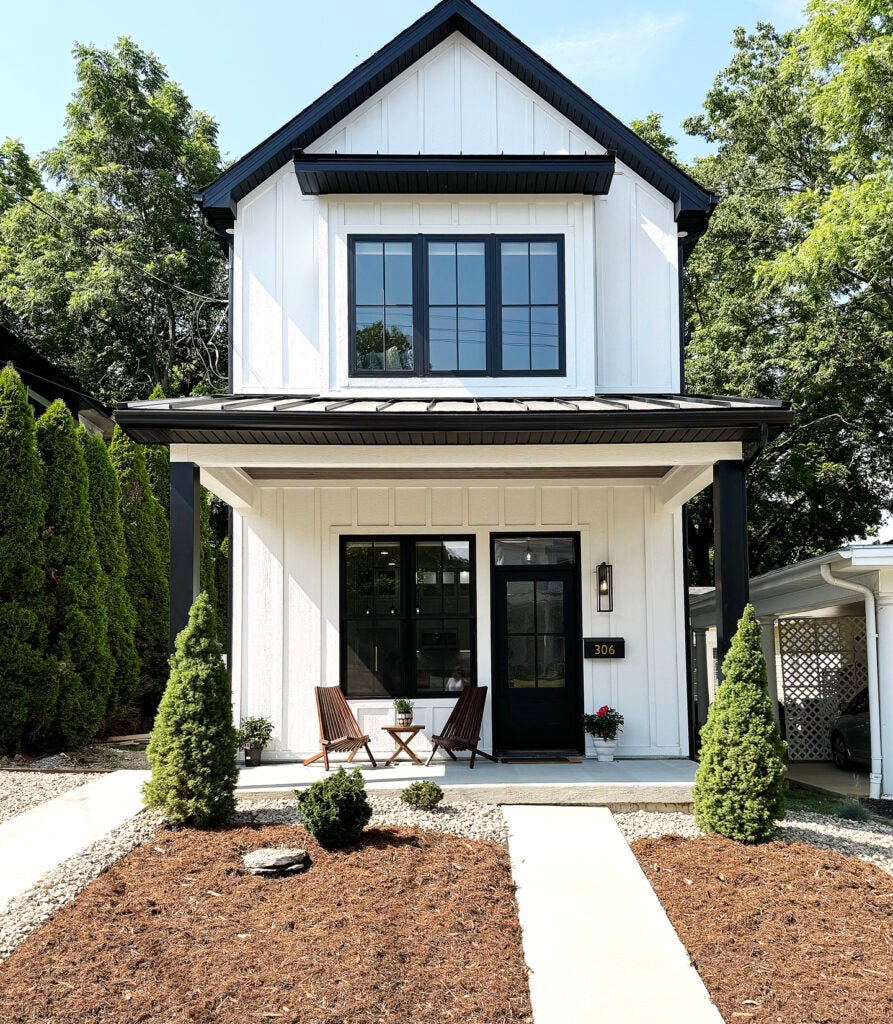
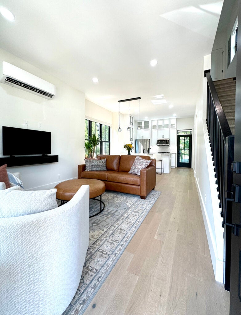
Chris and Mary Allison took on the challenge of living small with the construction of their new home. Their two bedroom one and a half bath home is designed in a stacked configuration of first floor kitchen and living spaces, and second floor bedroom spaces. The 10-foot ceilings on the first floor and 9-foot ceilings created using cutaway trusses on the second floor keep the spaces “lifted.” Open concept living, dining and kitchen spaces run from the front door to the back door with clear sight lines and wide hallway clearances. A window bump out for the dining area provides extra light and a few more feet of clearance around the table. The home also features a small laundry area, large bath with double vanities and a walk-in shower, a covered front porch and rear screened porch. Not one convenience found in a larger home is missing in this well-designed comfortable house.
Beautiful spaces can be accomplished, even in a small home, by following a few small home guidelines. With a great floor plan and purposeful design this beautiful new home in South Frankfort is appropriate, charming and perfectly livable.
- The theme. High contrast black windows (inside and out), white exterior siding and white interior walls create an on trend, high contrast aesthetic. The two-story elevations clad in vertical board and batten relates to the many wood frame homes found in the neighborhood area. The interior walls and trim, all painted in Sherwin Williams Alabaster are crisp and modern. Bright blue, hand blown globe lighting from Bicycle Glass, in the foyer and dining area, adds sparkle and a color.
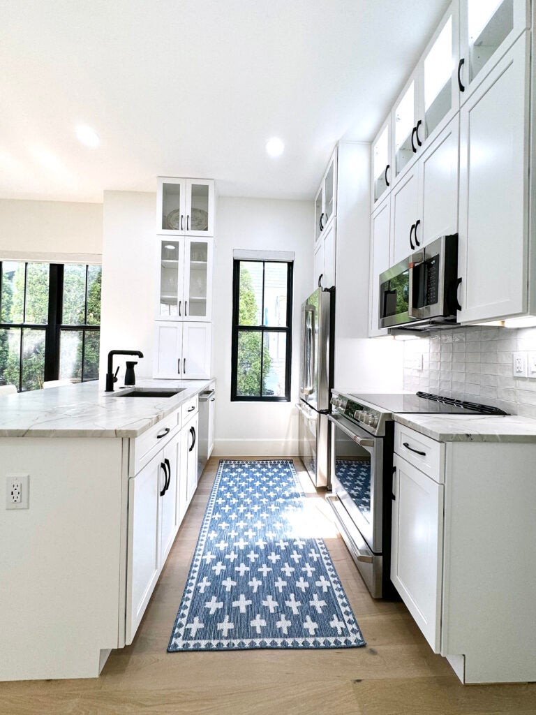
- The kitchen. The custom cabinetry in bright white serves as a foundation for the true focal feature of the kitchen — gorgeous white pearl (honed) quartzite. This natural stone is light in color but contains soft beige tone movement to accentuate its character. The 2-inch by 4-inch handmade tile in variations of white were installed for the backsplash with straight (not off set) joints for a modern look.
- The furnishings. With a narrow open concept floor plan, the furnishings were precisely sized to consider adequate clearances. Neutral color with the added textures of leather and loose woven textiles adds interest and keep the space from feeling cramped. Since there is only one living space, the furnishings had to be aesthetically pleasing, comfortable and durable enough for the homeowners large dog, Pippa. Pattern is limited to the rugs selected for the floors and pillows. Small amounts of blue to coordinate with the featured blue glass lighting keep the space cohesive throughout. Highly textured, yet neutral woven window treatments provide privacy and filtered light when needed. To create a flexible purpose and more usable space in the guest bedroom, Andy Doerr of Cambridge Woodworking constructed a Murphy style bed with built-in storage.
- The landscaping. The homeowner designed and installed the landscaping. By keeping plant material low and by introducing multiple textures, like mulch, river rock, a feature stone and concrete, the view from the street is structured, yet welcoming. A small driveway was built to accommodate off street parking.
- The team. The Allison’s managed the project themselves with the help of their son, Chris Cummins, with 84 Lumber. All of the construction materials, cabinetry and flooring were provided by Chris, or by sourcing completed by the homeowners. Design services were provided by Terri Bennett Interior Design. Window treatments were provided by Katie Welleford with Budget Blinds Georgetown. Numerous local sub-contractors also worked on the project.
