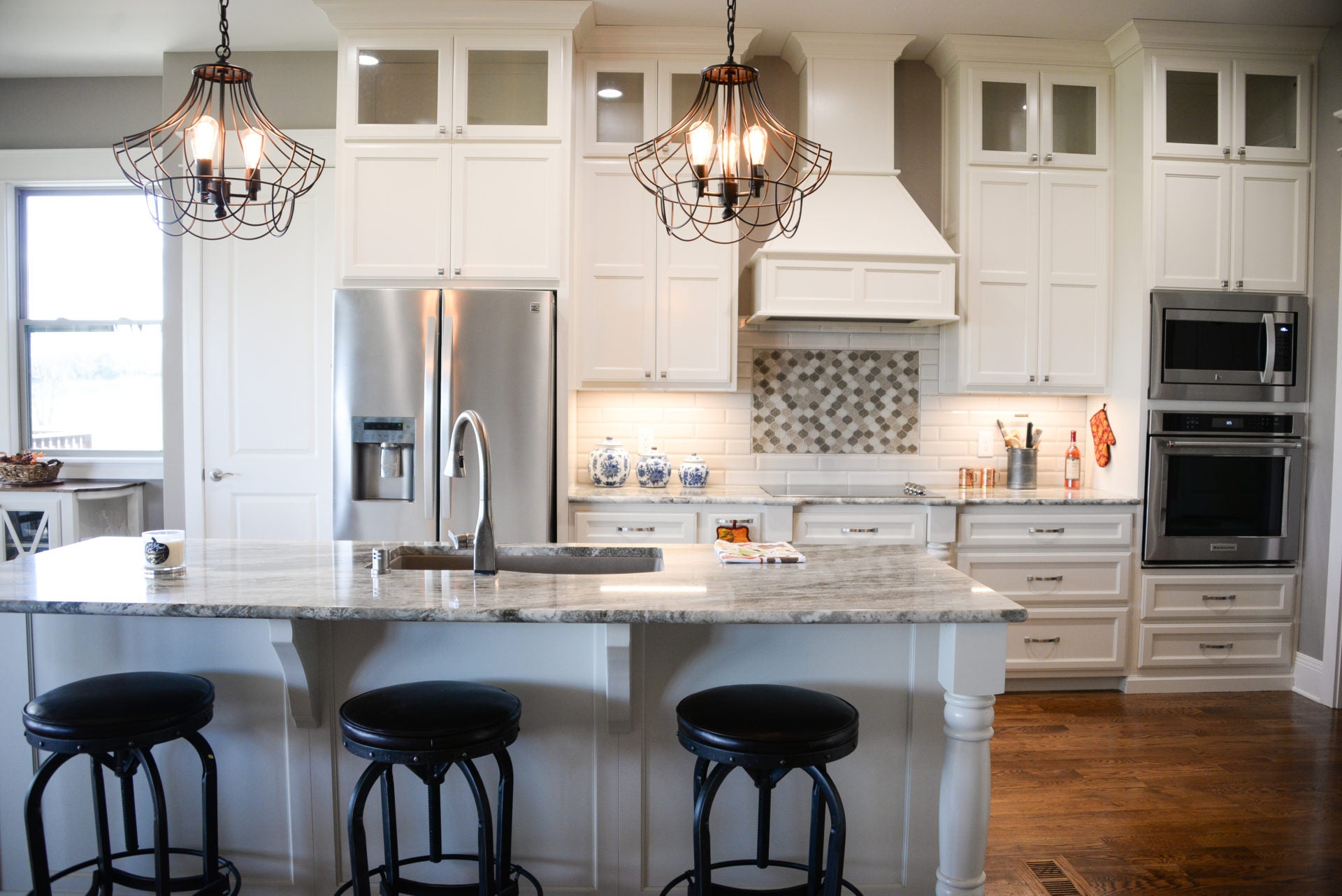
If there is a lesson to be learned by home renovations it is to not be bound by existing floor plans. Spaces can often be reimagined with a new purpose. The expansion of the kitchen footprint in this recent remodeling project eliminated the original powder room. It forced the relocation of the lavatory to a bathroom space that didn’t exist. With space taken from a former coat closet with a tweak of square footage from the master bath behind this perfectly sized powder room is a beautiful addition to this home.
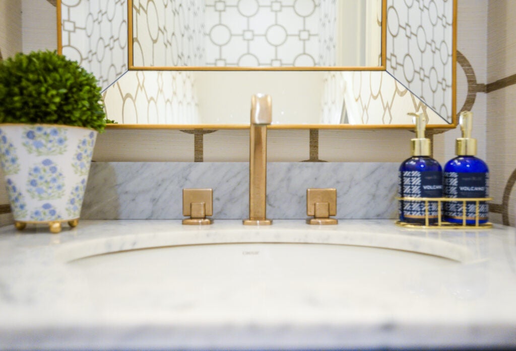
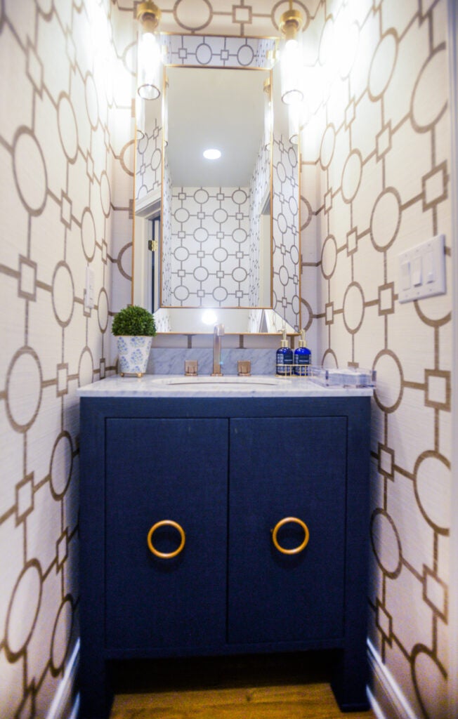
A powder room is a big design opportunity. It’s an opportunity to bring out your personal style by experimenting with bold pattern and unique materials. It’s a chance to get creative with sparkle and color. It can be elegant and striking beyond what is typically designed for other bathrooms. This powder room was designed with a theme of gold circles — circles in the wallpaper, hardware on the vanity, and in the round shape of the pendants. Where a master bath is generally luxurious and private and serves multiple functions — the powder room has just one. Because it is shared and appreciated by the homeowners, and guests, it can be a design story that creates a beautiful vignette.
- Layout. The original powder room was sandwiched between the kitchen and great room. The new powder room is across the open concept kitchen/great room to a location in the long run that is more private. Space was taken from a foyer coat closet which backed up to extra space found in the master bathroom. The layout is designed as a simple room, one that supports nothing more than a commode and vanity. The commode to the left, vanity to the right. The door swings out to save space.
- Vanity. To add a custom look to the room a high quality box vanity was used to provide the appearance of a piece of furniture. With the small square footage of the room, it was important to put the vanity on “legs.” The casual eye sees space under the vanity, which expands the room. A standard floor-based vanity would not have provided as much elegance or visual space. The navy finish adds a splash of color and personality. Circle cabinet hardware ties into a theme of circles throughout the small space.
- Lighting/mirror. The lighting and mirror selections needed to sparkle, but with deliberate purpose. A Restoration Hardware faceted gold trim framed mirror runs wall to wall. It was chosen to make the narrow room appear larger. Predictable wall sconces on the mirror wall would have taken up too much space with the large mirror. Instead, Visual Comfort pendants in brushed brass were hung from the ceiling. The effect of the pendants reflecting in the mirror adds sparkle and doubles the actual light generated from the pendants.
- Wallpaper. The Phillip Jeffries wallpaper in a large scale pattern of gold circles sets the theme. It is natural in color, vivid in pattern. This printed natural fiber wallpaper would typically not be used in a bathroom because it wouldn’t hold up to moisture. In a powder room where there is a limited amount of water, it can be used to elevate the style and add unexpected glamour.
- Vignette. Positioned in the foyer area views into the space provide peeks into this elegant space. The pattern of the wallpaper that is a small shift in the calm neutrality of the other spaces draws your eye into the vignette. The subtle gold and ivory color mimics the adjacent areas and presents itself beautifully. Elegant, interesting and perfect for this smartly designed home.
