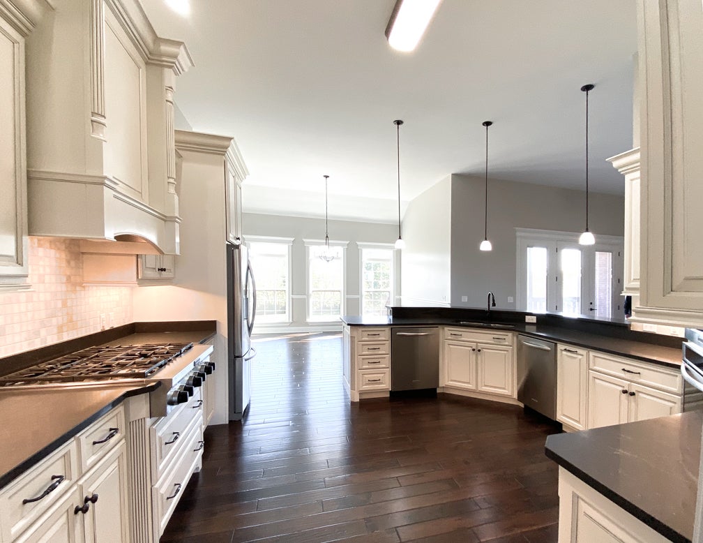
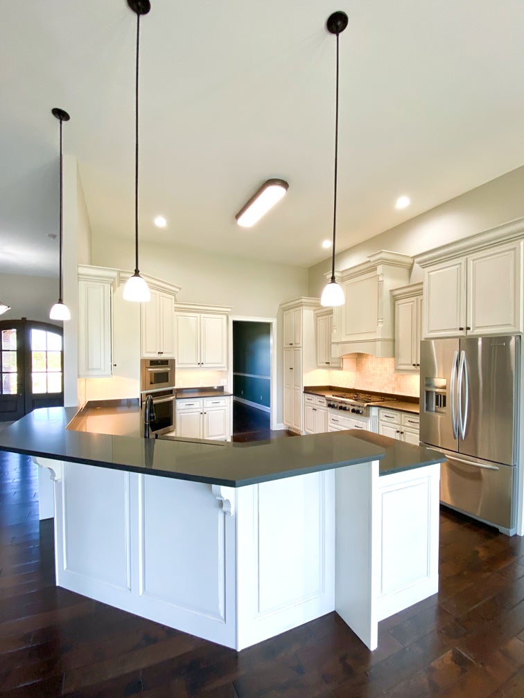
The average full kitchen renovation can cost upwards of $40,000. A detailed look at what really needs to change is sometimes a simpler option. The owners of this newly purchased luxury home were drawn to the practical main floor living ranch layout and the plentiful auxiliary spaces in the basement. But the builder grade materials and dark color choices didn’t match their personal aesthetic. Before moving into the home, these homeowners undertook a significant renovation of several key rooms — the great room, master bath and the kitchen.
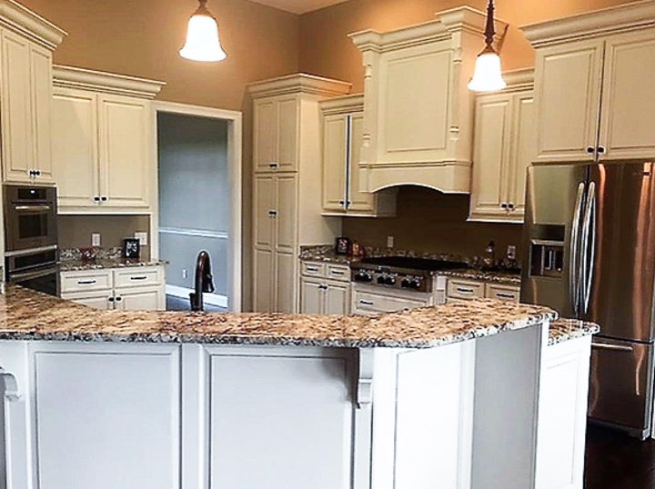
The kitchen included quality Barber Cabinetry, but was lacking in other areas. Without taking on a full kitchen renovation, upgrades to lighting, paint, stone and tile were incorporated to transform the kitchen into a more tasteful, coordinated space.
More than just the inclusion of personal choices, every single update added value. Value is found in the quality of the materials added, as well as professional guided design. The new kitchen is no longer a “builder” kitchen, but a kitchen that has been thoughtfully planned around their tastes and lifestyle.
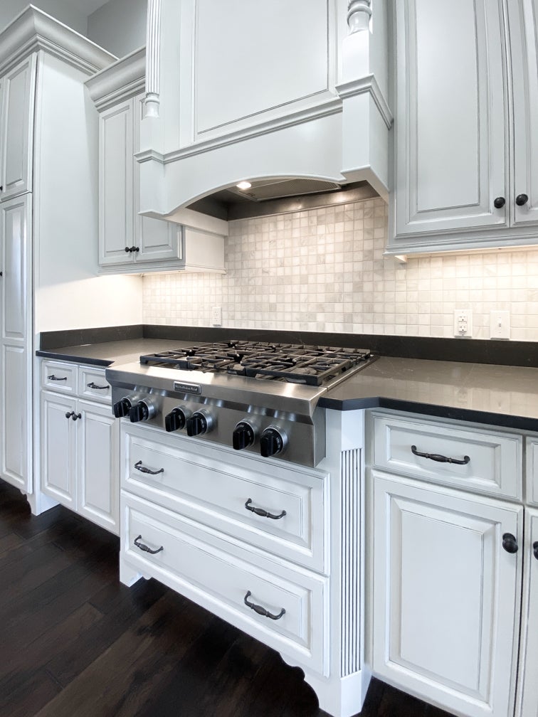
- Stone. As a naturally occurring product, granite features mottled mineral tone coloring. The elegant grey/brown glazing of the cabinetry was intended to provide focus to the highly detailed cabinetry, but the busy multi-colored granite took away from the elegance of the cabinetry. A more neutral Vadara Petra Grigio quartz, fabricated by Counter Culture (Lexington), provided warmth and much calm. The rich brown background color and subtle white and gray veining is in perfect balance to the cabinetry.
2. Tile. As a counterbalance to the now darker countertops, a pretty marble backsplash was installed on the range wall. The marble intentionally features subtle amounts of cream, brown and gray veining that ties to the more solid tone quartz and the warm glazing of the cabinetry. The two-inch square tiles, installed by Ryan Dawson of Kentucky Tile Works, are correct in scale for the size of the kitchen. The effect of using a backsplash only on the wall of the cooking area keeps the visual weight of the kitchen lighter and brighter.
3. Lighting. Replacing box store lighting fixtures with more thoughtfully designed lighting can have a major impact on the aesthetic of a room. Just because a fixture has a gold accented finish with swirls and curlicues doesn’t make it look more expensive, or make it the right choice. Always choose lighting correct in scale and appropriateness for the furnishings in a room. Achieving a good quality of light is almost as important as the selection of lighting fixtures. Using the expertise of Mark Wright of Dunn Wright Electric, the color value of the light sources is corrected. High quality LED lighting now replaces the amber (yellow) tint of traditional incandescent bulbs.
4. Paint. With the color quality of the lighting corrected, so was the paint. The previously muddy brown walls were brightened with Sherwin Williams Agreeable Gray (SW7029). This soft gray was chosen for its subtle contrast to the ivory cabinetry and for its neutral softness. This color was used throughout the foyer and great room areas to create continuity. To add interest and depth, Sherwin Williams Studio Blue Green (SW0047) was used in the adjacent dining room and office.
5. Windows. White two-inch blinds (in process) were chosen for the window treatments because of their function. Window blinds with an inside mount can be used in windows where the main windows and transoms windows are trimmed with pretty detail. When building a home, one of the most expensive elements is the windows and related finish carpentry. Why cover this detailed work? Let the beautiful architectural elements be a feature.
