New year predictions by home design magazines and industry professionals are always fun to peruse, especially in the world of kitchen design. These glamorous predictions are focused on large metropolitan areas where budgets are generous and interior design is forward thinking. Our much smaller market is slower moving, and never fully adopts worldly design trends.
Our kitchens have become more than functional cooking space. They are gathering spaces, homework stations and home office space — the focal point of our home. With today’s inflated pricing, you can count on spending up to 20-25% of the value of your home on a kitchen renovation. While modern style may be a goal, what may be more important is making the most out of the high cost of construction by planning spaces for the way we live.
Renovations are hard, solution-based projects. It is very difficult to translate a pretty, photoshopped magazine clipping into a successful kitchen renovation. (And copying one does not make you a designer.) With renovation projects it is important to seek professional interior design — for practicality and longevity, if for no other reason. Pinterest and Instagram are highly influential resources. They brought us the decade old cover everything in gray trend. Understand the limitations. It is not so much what you want today, but what you might want when a trend expires. Rather than sticking with classics, followers now find themselves wishing they had taken a more subtle approach. The key is to avoid trends by working with classic choices. A kitchen that is practically implemented will result in a project that will serve you and your home for years to come.
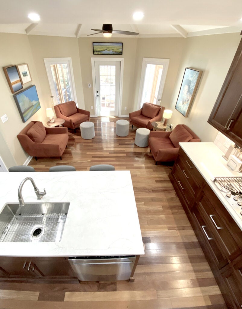
- Multi-purpose areas. Our kitchens are natural gathering spaces. We make room for homework, office work, and friends and family, all in a casual space. The key is to incorporate comfortable seating, generous work surfaces, good lighting, and a pleasing aesthetic.
- Color selection. Stick with classic color. Kitchens don’t need to be white to be classic. Warm ivories and navy are perfect transitional colors. One often used designer tip is to “hide” or diminish the size of a large island by using a dark color paint or stain. Dark color recedes and makes things look smaller. Simple door styles and non-themed hardware remain pleasing much longer than over styled fussiness.
- Backsplash statements. Choose your backsplash wisely. Too much of a statement becomes old and dated quickly. An ill-chosen backsplash is like a tattoo. It will last until it is forcibly removed — choose wisely. The best choice for a backsplash is something that adds interest without stealing the show.
- Aesthetic blending. Design should flow from room to room, and area to area. Sight lines between rooms should connect visually and aesthetically. A glass door to the patio area should support the relationship between the kitchen and the outdoor area. Anything you can see, and see through, should be a part of the thought process in both style and theme.
- Spend wisely. Choose the best quality you can afford. Your hard-earned money will be put to good use if you plan as if you are building for the future. What do you want your home to look like 5 or 10 years from now? Hire the best your money will allow. The investment you are going to make in a kitchen project justifies securing an experienced interior designer and contractor. Fewer mistakes are made, which saves money in the long run.

A kitchen where a small seating area where an eat in dining area would traditionally be located was incorporated to accommodate casual conversations. Note the connection to the screened porch beyond. (Photo submitted) 
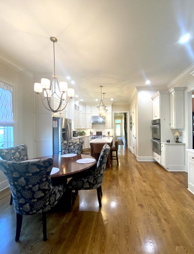
A kitchen designed with classic ivory and taupe color tones carry from room to room, inside and out. (Photo submitted)


